
It’s no secret that consumers eat with their eyes when shopping for food. So, while your food items might taste terrific, you’ll have a hard time hitting your sales targets unless you’ve got some quality packaging design to match.
In this article, we’re going to get inspired with a look at some of the best food packaging examples. We’ll take a close look at each one to see why it works and what lessons we can take away.
Here’s the roundup:
- Tony’s Chocolonely
- Müller Corners
- Babybel
- Hrum-hrum Hazelnuts
- Jif Lemon Juice
- Pukka
- Starbucks
- Toblerone
- Tabasco Pepper Sauce
- Pringles
Let’s dig in!
1. Tony’s Chocolonely
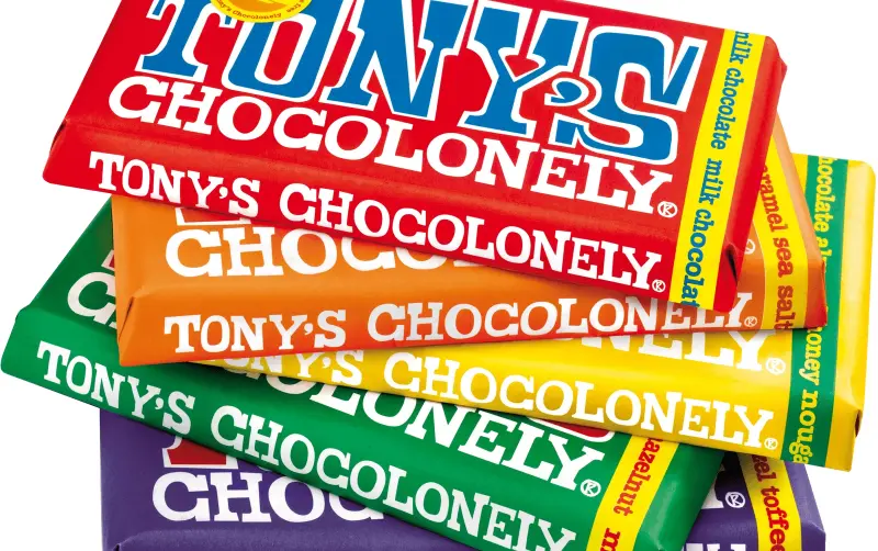
Image source: Tony’s Chocolonely
Tony’s Chocolonely is a Dutch company that’s quickly becoming one of the most popular chocolate brands around.
The products stand out on the shelves because of their bold and colorful paper wrappers that immediately catch your eye. Each bar is packaged in matte, vibrant colors with striking, playful designs and fonts that reflect the brand’s wacky personality. Whenever I see these bars in-store, they give me some serious “Charlie and the Chocolate Factory” vibes.
The high quality paper and color used also convey a sense of quality around the products themselves, too. The products sit at a slightly higher price point than a lot of other chocolate bars, but the entire brand experience makes it feel worth the extra cash.
Tony’s product packaging isn’t just about looks, either. Unlike most plastic packaging, Tony’s is a great example of sustainable packaging material thanks to its paper outer layer. And Tony’s Chocolonely also uses its wrappers to highlight its mission to make chocolate 100% slave-free, providing information about fair trade practices and the importance of ethical sourcing.
The fast way to get feedback on packaging
Get clear and collaborative comments right on top of your packaging artwork.
2. Müller Corners
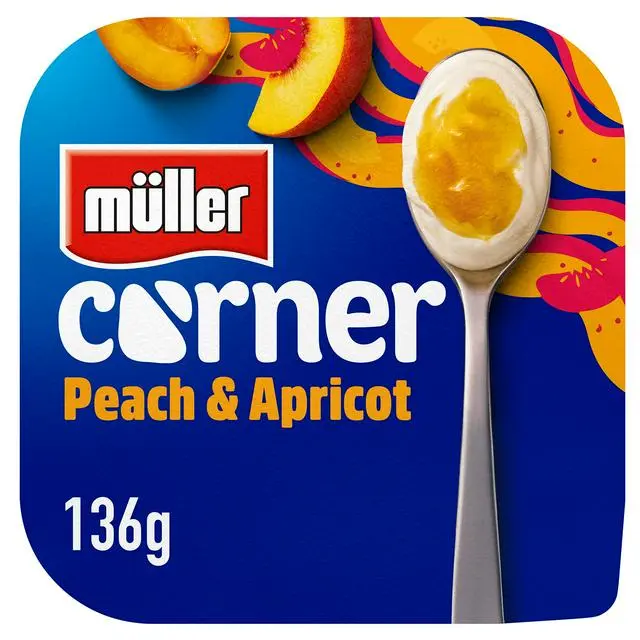
Image source: Müller
Müller is a German brand that produces dairy products for the masses across Europe and beyond, with its most iconic offering being the Müller Corners yogurts.
These yogurts came to market back in 1988, featuring a single portion of yogurt alongside a smaller compartment of fruit compote, cereal, chocolate, and other tasty bits. Then, all customers had to do was tip the treats into their yogurt, mix it up, and enjoy.
I’ve included Müller Corners’ food containers in this list of packaging examples because of its innovation and practicality. The packaging allowed consumers to combine the ingredients just before eating, maintaining the freshness and texture of both components. This made it the perfect addition to school lunchboxes and on-the-go snacks alike.
Müller Corners have remained largely unchanged since their creation almost 40 years ago. Hey, if it ain’t broke!
3. Babybel
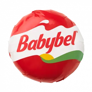
Image source: Babybel
While I’d be lying if I said this cheese didn’t give me the creeps as a kid (that texture, no thank you …), there’s no denying that its packaging is incredibly clever. Mini Babybel hit the chilled aisles way back in 1977, and disrupted the category with its bite-sized cheeses coated in a playful red wax packaging.
The key takeaway from this food packaging example is just how important it is to cater to your target audience. Babybel was created for kids to give them a quick, calcium-packed snack any time of the day. And its small, round, red packaging mechanism has appealed to youngsters around the world for decades. It’s playful. It’s pocket-sized. And it stands out by unapologetically appealing to kids and the way they like to snack.
Want to see what NOT to do? Check out these bad packaging designs from brands that learned the hard way.
4. Hrum-hrum Hazelnuts
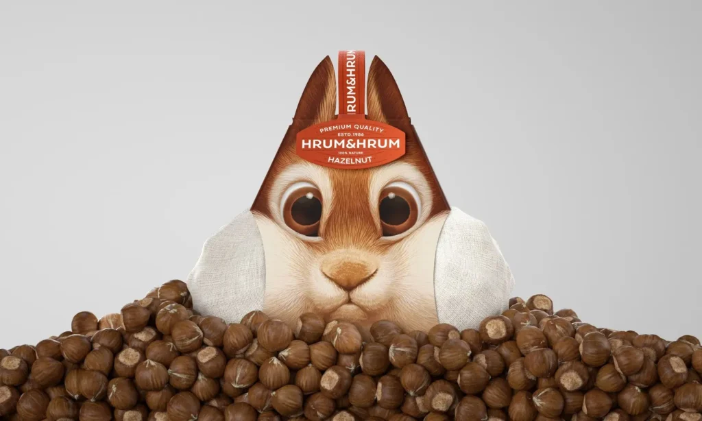
Image source: Packaging of the World
This food packaging example has been making its way around the web for years now, thanks to its tongue-and-cheek humor and creativity.
The clever thing about this packaging is that, not only does it stand out for being fun and playful, it also conveys a message that the product itself is natural and fresh. So, if you decide to have fun with your food packaging materials in this way, it’s a good idea to come up with a playful concept that links back to one or more of your product’s unique selling points. Hitting that sweet spot between being bonkers and informative with your food packaging will help you sell more in the long run.
5. Jif Lemon Juice
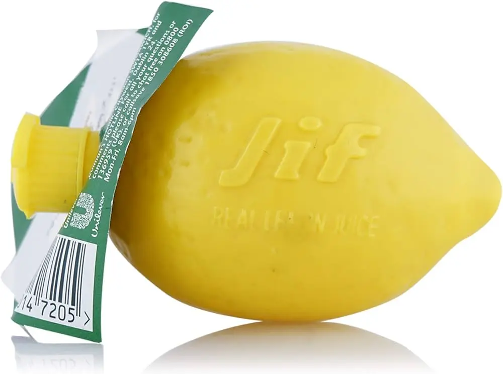
Image source: Wikipedia
Sold in a lemon-shaped plastic bottle, Jif Lemon Juice’s food packaging communicates exactly what the product is at a glance for immediate recognition and greater shelf appeal. As an added bonus, this easy, squeezy, flexible packaging gives users more control over the amount of liquid that comes out. This kind of functionality is essential for consumers who need quick and efficient solutions in the kitchen.
The key lesson here is that using shapes and visuals that directly convey what the product is can boost consumer recognition and interest. It’s a simple approach that can work wonders for a variety of different food categories.
6. Pukka
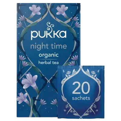
Image source: Pukka
Standing out from the competition isn’t easy in the food packaging industry, especially when it comes to a crowded category like teabags. But over the years, Pukka has managed to differentiate itself with the use of a bright color palette and ingredient-inspired illustrations. As far as box design ideas go, Pukka nails it.
Pukka’s tea packaging conveys a sense of ease and freshness, while also making it easier for tea lovers to find their perfect tea by using simple, informative messaging on each box of teabags.
What’s more, Pukka’s packaging is made from 100% recyclable materials, with every box being made from FSC certified card. It also uses some plant-based materials too, including vegetable inks. By creating bright, simple, and sustainable packaging, Pukka uses its boxes and tea sachets to convey the brand’s values and reduce food packaging waste, which makes it a trusted choice for many.
7. Starbucks
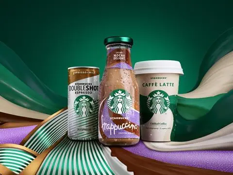
Image source: Starbucks
Sometimes, simple and stripped-back food packaging design is the best way to set your food product apart from competitors. Starbucks is a great example of this, with its beverage packaging and merch most often featuring its iconic logo against a plain white background.
Starbucks’ simplistic design approach has helped the coffee giant grow into one of the biggest brands. These days no matter where in the world you are, there’s a good chance you’ll see and recognise this food packaging on the streets around you.
Want to see more from Starbucks? Check out our roundup of the best coffee ads.
8. Toblerone
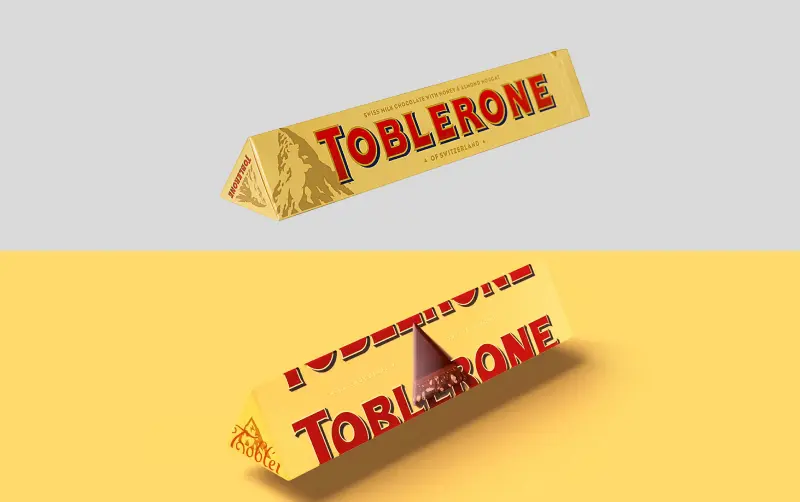
Image source: Toblerone
Toblerone is another prime example of effective food packaging because of its distinctive triangular shape based around the Swiss Matterhorn mountain. This iconic food packaging was designed to reflect Toblerone’s Swiss heritage to tell a compelling story and build a strong brand connection with consumers.
It’s said the original goal was to position Toblerone as the perfect gift for people to bring back from their ski holidays in Switzerland. But soon it became the gift to bring back from any trip abroad. Now, you’ll find it piled high in most airports across Europe. Handily enough, the triangular packaging also protects the chocolate bar from breaking before it reaches its final destination!
By taking note and incorporating story-driven elements into your food packaging, you’ll be better able to create a powerful and memorable presence.
9. Tabasco Pepper Sauce
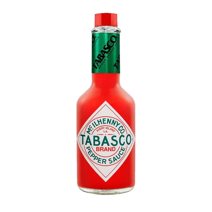
Image source: Tabasco
Tabasco Pepper Sauce’s packaging is iconic and instantly recognizable. The clear glass bottle with its distinct red cap and diamond label has remained largely unchanged for over a century, emphasizing the brand’s heritage and reliability.
The simple, white label design works well to highlight the vibrant red color of the product inside. But the most notable thing about Tabasco’s packaging is the small, compact size of the bottle. This makes it clear from the get-go that a little goes a long way with this fiery hot sauce. It also makes it easy to carry around and use at any time. Because you never know when you’re going to want to give your meal an extra kick!
10. Pringles
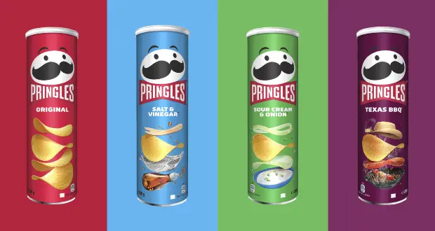
Image source: Pringles
This list of the best food packaging examples wouldn’t be complete without a nod to Pringles. Pringles is a great example of innovative food packaging due to its unique cylindrical canister.
The packaging protects the chips from damage, enhances shelf life, and creates a large surface for branding and information. Most notably from a consumer perspective, the design instantly stands out on store shelves. Choosing packaging materials that have both visual and functional benefits is a great move!
The fast way to get feedback on packaging
Get clear and collaborative comments right on top of your packaging artwork.
Final thoughts
Consumers will often form a first impression of your products based on your food packaging. So, it’s important to get this marketing step right when launching or developing your brand.
Hopefully this article has inspired you to create some stunning food packaging solutions. But if you’re hungry for more, check out our roundup of the latest packaging trends.
And if you’d like to see how Filestage can help you review and approve all your packaging content, start your free trial today.