When it comes to creating a brochure, design is everything. Whether you’re aiming to promote a new product, showcase your services, or draw attention to your upcoming events, a well-designed brochure can capture your audience’s attention and leave a lasting impression.
But where to begin?
To help you get started with your next brochure design, I’ve compiled 15 inspiring brochure ideas to spark your creativity. Once we’ve explored these ideas and discussed their standout features, I’ll share some key takeaways to help you design a brochure that looks great, captures your audience’s attention, and ultimately drives sales and sign-ups.
Let’s get started!
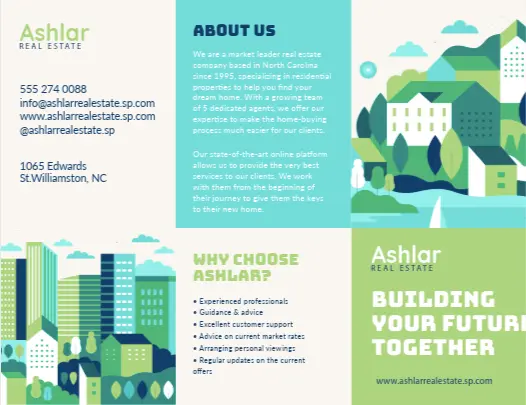
1. This elegant real estate brochure design from Charles Roberts Studios
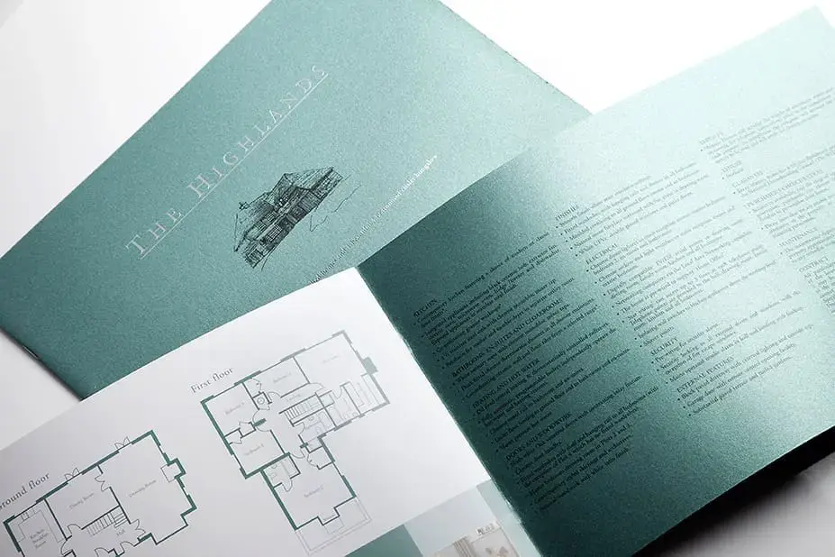
Source: Charles Roberts Studios
Your brochure design should be a clear reflection of your products and services. So when it comes to real estate brochures for premium properties, sophisticated brochure design is essential. This elegant design from Charles Roberts Studios hits the nail on the head. The rich color choice combined with silver lettering on the front cover immediately suggests top quality, while the hand-drawn illustrations show that care and attention are being given to the listing.
Inside, clearly-labeled floor plans, high-quality images, and bullet-pointed information give prospective buyers a clear overview of the property being advertised, giving them as much information as possible upfront before they commit to a viewing.
Less review rounds, better designs
Get quick and clear feedback right on top of your designs with Filestage.
2. This interactive digital brochure design from IKEA
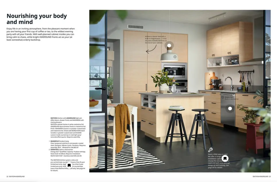
Source: IKEA US
Digital brochures are a brilliant way to reach a wider audience with your material. They’re environmentally friendly, cost-effective, and easy to update with new information. And the best bit – they can be enhanced with interactive design elements like hyperlinks and embedded videos to provide a more engaging user experience.
This digital brochure is an excellent example from IKEA, with a fun use of interactivity to entice customers. Clicking on one of the interactive icons either brings up a pop-up window with more information or directs users to another page, seamlessly guiding them along the journey to eventually making a purchase.
Learn more about how to make a product catalog.
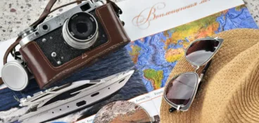
3. This creative brochure design from Contiki
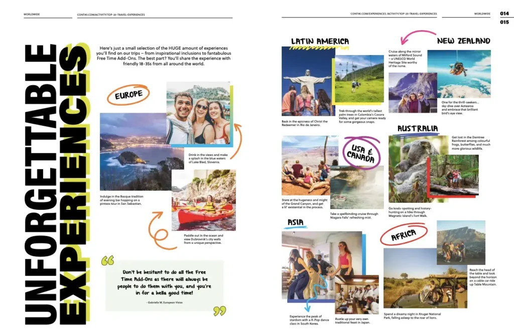
Source: travel brochure
When you’re designing a brochure – or any other marketing materials for that matter – your target audience should be front and center of every decision. From color schemes and typography to image choices and other visual elements, every aspect of the brochure should appeal to those that matter.
This travel brochure example from Contiki does a great job of aligning its graphic elements with its target audience. Modern typography, bold colors, and user-generated content make the brochure feel fun and youthful – ideal for social media marketing and the target audience of 18-35-year-olds. Genuine photos from previous tours and positive testimonials give the brochure authenticity too.
4. This professional brochure design from the Stanford Graduate School of Business
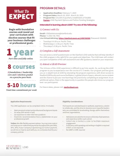
Source: Stanford Graduate School of Business
Compared to retail and travel brochures, academic and training course brochures generally need to be somewhat more formal and serious. They should give off an air of professionalism, providing detailed information about the course and the institution. But they should still be engaging and visually appealing to grab the reader’s attention and pique their interest.
Stanford Business School strikes the balance with this brochure design. There’s plenty of information on the page, broken into columns and text boxes to make it easier to digest. Then there’s the bold use of red – in line with Stanford’s branding – to add an element of visual interest and break up the monochrome.
5. This ultra-personal dental clinic brochure design from Ware Dental
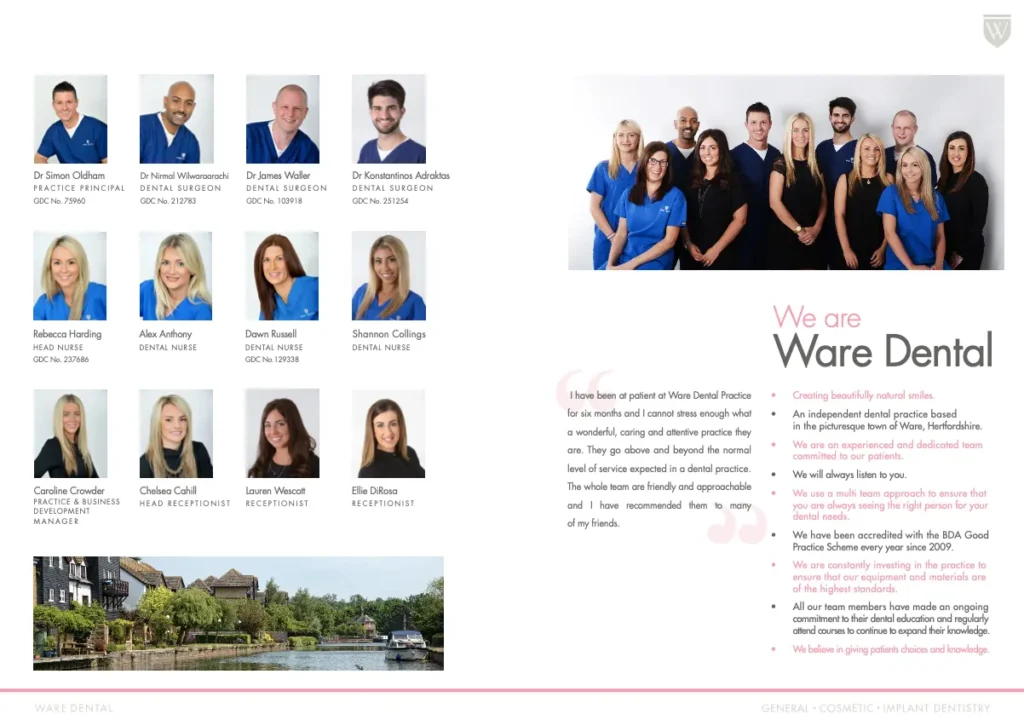
Source: Hertfordshire Dental Group
If you’re designing a brochure for a business where personal relations are key, then including headshots and even short bios of the team helps build trust and rapport with potential customers. This is especially important for dental clinics, given that 36% of people in the U.S. have a fear of the dentist! Giving customers a chance to get to know the team before their first visit helps them to feel more comfortable and prepared to face their fears.
In this print collateral example from Ware Dental, you can see that the practice has also clearly outlined its ethos and included a customer testimonial. Setting out your values and principles on the pages of your brochure helps potential customers to get to know you as a brand or a business, and including positive reviews helps to build that all-important trust.
6. This high-contrast brochure design from MSI
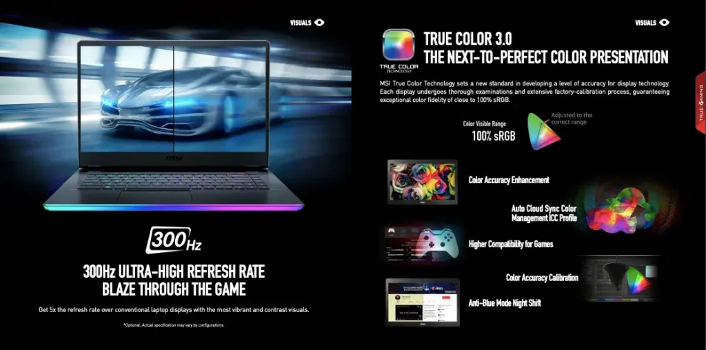
Source: MSI
You may have noticed that most of the brochure designs featured so far have stuck to white as their background color of choice. Here’s something a little bit different. MSI has gone against the grain and opted for a dramatic black backdrop for its brochure. This striking and unique design uses white text for a high-contrast, eye-catching effect, flipping the traditional black-and-white color scheme on its head.
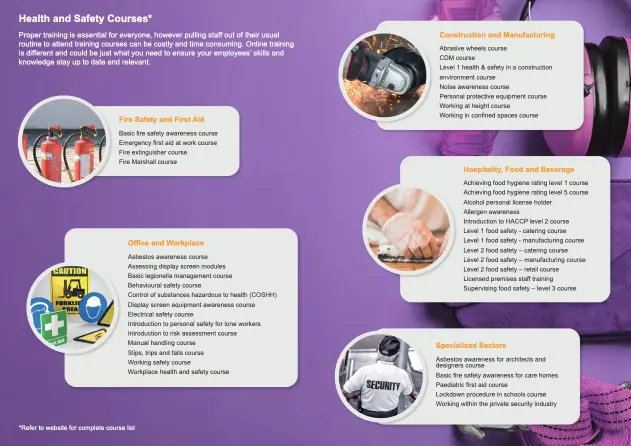
7. This well-organized catering brochure design from Eden Caterers
Source: Eden Caterers
When offering a variety of options to customers – such as gym memberships, internet speed packages, software subscription tiers, or menu packages – it’s essential to make comparisons easy. Clear and straightforward comparisons help potential customers to quickly understand the differences between your offerings. And this clarity can make them more likely to choose one of your services.
In this example from Eden Caterers, menu packages (and their prices) are laid out side by side so potential customers can easily see the difference between the three options. That way, they can make an informed decision based on the dishes and the cost.
8. This attention-grabbing brochure cover from EF Languages Abroad

Source: EF Languages Abroad
I know, I know, you should never judge a book by its cover. But when the goal is to stand out from the crowd (when displayed on a big brochure stand, for example), your brochure’s front cover needs to be eye-catching. Most modern brochure designs feature a single, large photo covering the entire page. This creates a strong visual impact that immediately grabs the reader’s attention – packing more of a punch than using lots of small images.
This brochure cover from EF Languages Abroad uses a brightly colored photo of two smiling teenage girls, symbolizing the connections young people could make through EF – and the happiness they’d experience studying abroad! The use of bright colors adds to the air of positivity, drawing the reader in and encouraging them to open up the brochure and find out more.
9. This minimalist brochure design from Aman Spa
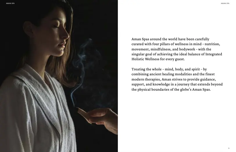
Source: Aman Spa
This minimalist design is everything you want from a brochure for a spa. It’s pared back. It’s subtle. It exudes calm and relaxation. The beautiful photography paired with minimal text creates a soothing visual experience, and leaving ample space on the right side of the page adds to that feeling of serenity. Book me in, pronto!
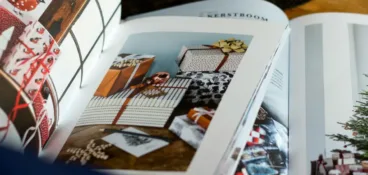
10. This wedding venue brochure design from Pelham House
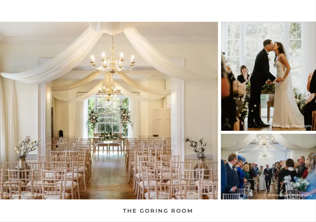
Source: Wedding Venues Enquiries
In this design, entire pages of the brochure are dedicated to images, which is crucial when you’re showcasing wedding venues and other event spaces. Imagery plays a vital role because it helps potential clients to visualize the setting for their future events.
The images on this page show the room from three different angles and perspectives, helping future brides and grooms to imagine exactly what their wedding would look like if they were to choose this venue. The right choice of photos could well evoke emotions in the happy couple, and an emotional response is all the more likely to lead to a reservation!
11. This sophisticated brochure design from Neptune
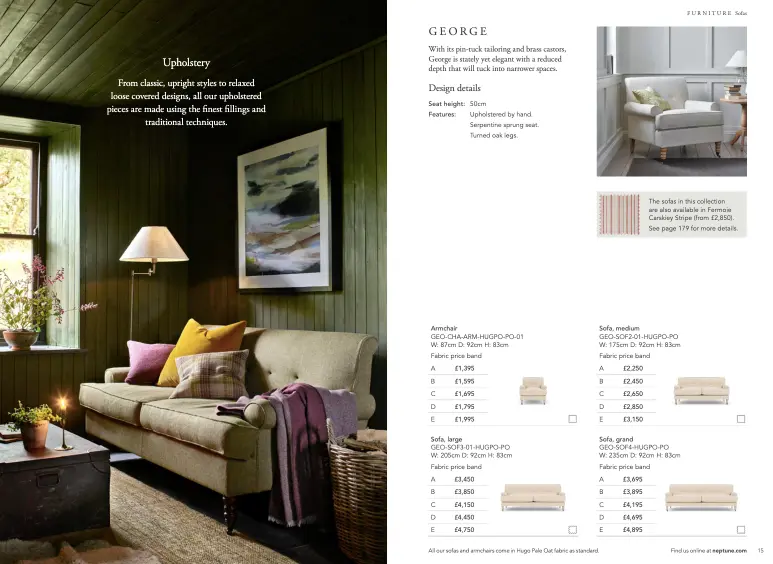
Source: issuu.com
Can’t decide between product and lifestyle imagery for your brochure or a catalog? Use both! Showing the product in situ helps customers imagine how the product would look in their own home, while product imagery gives users a detailed view of the item itself.
In this example from Neptune, lifestyle and product images work together on the page to give customers a comprehensive understanding of the product’s aesthetic and functionality. Different price bands are clearly laid out too, leaving customers with zero confusion regarding the cost of their chosen sofa or armchair.
12. This e-learning brochure design from Tinderbox
Source: issuu.com
Set against a vivid background, this brochure design from Tinderbox uses text boxes and images in different shapes and sizes to add visual interest to its brochure. This is a prime example of picking key information to display, and keeping copy to a minimum to avoid overwhelming the reader. The call to action encourages customers to visit the website to find out more, keeping them in the sales funnel and guiding them towards the next step.
13. This compelling charity brochure design from A Growing Culture
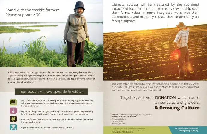
Source: issuu.com
Including clear calls to action is essential in your brochure. Whether it’s for purchasing products, signing up for services, or reaching out for more information, having a straightforward call to action encourages potential customers to take immediate action.
This brochure page from the charity A Growing Culture provides detailed information on how to donate, and provides contact information and the website address for supporters who might need extra help or information.
The page also highlights how donations will make a tangible impact, providing a concise and compelling summary of the brochure’s key points. This serves as a final appeal to inspire potential donors to take action.
14. This brochure design from Worthing Theatres and Museum
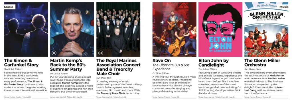
Source: Worthing Theatres and Museum
If you’re organizing a series of events, there are several ways to display that information in your own brochure. You might choose a list, a calendar, a timeline, or a grid layout. This example from a local theater uses a grid layout with six images side by side, each with captions underneath, filling the full double-page spread.
The balance between text and images is just right, allowing readers to get a good overview of the events at a glance, without information overload. The use of bold text helps readers to quickly skim the content to find key information – and once they’ve got a basic idea of the shows available, they can choose where to focus their attention.
15. This tri-fold brochure template from Adobe
Source: Adobe
Tri-fold brochures are ideal for providing customers with quick and accessible information. Their compact size and organized layout make them useful in a wide range of scenarios – whether that’s at a trade show, in a tourist information center, at a medical clinic, or in a realtor’s office.
Tri-fold brochures are double-sided and have plenty of space for info, but while it’s tempting to go to town filling them with everything you think the customer needs to know, it’s important to only include key information. This brochure template from Adobe demonstrates how to strike that balance, with copy cleverly balanced with imagery to avoid overwhelming the reader.
Adobe has thousands of brochure design templates to choose from – ideal if you’re not a professional designer! Plus, it allows you to create other promotional materials like catalogs or posters. Top tip: sign up for a free trial and you can download up to 10 free brochure templates (or other stock imagery to use in your brochures).
Discover the best brochure design software to help you create professional brochures with ease.
Six lessons you can take from these brochure design ideas
- Understand who your target audience is and tailor the content and design to suit them
- Create an eye-catching cover that encourages the reader to open the brochure
- Use your brand’s colors, fonts, and logos consistently to reinforce brand identity
- Include relevant, high-quality images to keep your audience engaged and to showcase your products and services
- Keep text concise and to the point, and break information up with headings, columns and text boxes to make it easy to read
- Include clear calls to action, such as contact details, website links, or prompts to visit or purchase to encourage readers to take immediate action.
Final thoughts
I hope you’ve enjoyed exploring these brochure design ideas and have come away feeling inspired to get started on your next brochure!
A key part of the design process is review and approval – it’s important to get the right eyes on your brochure design to make sure everything is accurate, on-brand, and error-free before you print or publish it.
If you’d like to see how Filestage can streamline your review process for all your marketing materials, start your free trial today.