They say not to judge a book by its cover. But when it comes to your catalog, that’s exactly what customers are going to do. Your catalog cover is your first chance to grab attention, leave a lasting impression, and ultimately drive sales.
Research shows that 55% of consumers have bought something they saw in a catalog within the past year. That’s why designing a cover that resonates with your audience and encourages them to dive in should be a top priority.
With that in mind, here are eight inspiring examples to spark ideas for your next catalog cover design.
1. IKEA

Source: IKEA Museum
IKEA knows a thing or two about design, and this catalog cover is yet another example of that.
Bold and attractive visuals? Check.
Eye-catching heading? Check.
Clear branding? Check.
And this cover design hits the absolute sweet spot – showcasing plenty of products without feeling cluttered. In true IKEA fashion, everything about this cover design is clean, functional, and effortlessly stylish.
Like this? Discover more catalog examples.
Learn how to make a catalog in 7 simple steps
And discover three tools that will help make your catalog project a success.
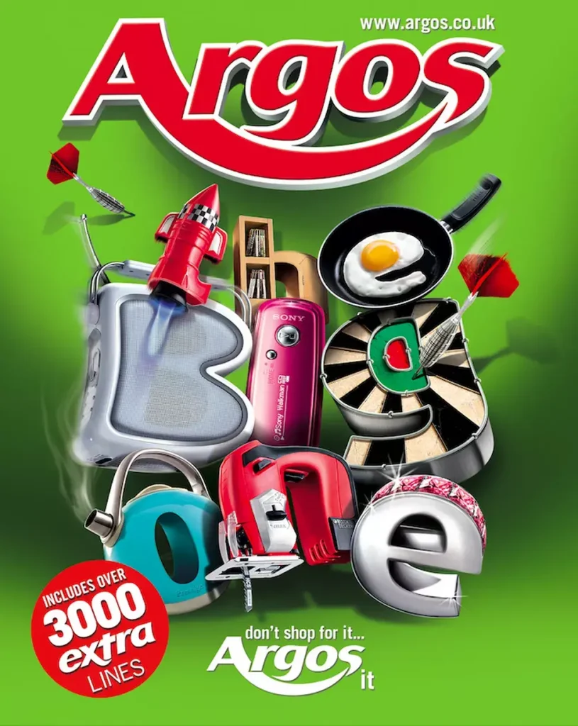
2. Argos
Source: Daily Record
In the UK, there’s little more nostalgic than an Argos catalog. Before the days of internet shopping, you’d sit down, mark the pages, and dream up your birthday or Christmas wishlist from its endless selection of products. This cover design reflects that warm, fuzzy feeling of excitement and anticipation.
The playful reimagining of its products into a bold, bouncy font immediately grabs customers’ attention while highlighting the diversity of items available – from toys and tech to household essentials.
The cover also incorporates Argos’ famous tagline, “Don’t shop for it, Argos it”. This serves as a useful call to action, and it also reinforces the brand’s reputation as a one-stop shop for pretty much everything.
3. Patagonia

Source: Issu
Sometimes simplicity is the most powerful tool. Striking visuals and its iconic logo are all it takes for Patagonia to capture the hearts and minds of its audience and encourage them to explore its full catalog.
The brightly colored, eye-catching photo draws you in and instantly creates a sense of wanderlust and adventure. All while showcasing that Patagonia’s gear is built to stand up to the toughest conditions. It’s a simple design, but it’s super effective.
Want to learn how to design such memorable catalog covers? Check our our catalog management guide!
4. Crate & Barrel

Source: Issu
This color-coordinated catalog cover page is a perfect introduction to Crate & Barrel’s seasonal color book. The clean and minimalist cover design captures the brand’s signature look – classic, stylish, and modern. So from first glance, customers can see what Crate & Barrel is all about.
The bold black font stands out against the neutral backdrop, while the carefully (and so, so satisfyingly) arranged colorful bowls offer a sneak peek of what’s inside “the color book”.
It’s smart, it’s aspirational, and it wouldn’t look out of place on your coffee table!
5. L.L.Bean

Source: Design Boom
Let’s step back in time for this next cover design – to 1933 to be precise. This vintage catalog cover from American outdoor and clothing brand L.L.Bean features a classic illustration that reflects the brand’s roots as an outfitter for outdoor enthusiasts.
As you can see from this next image (created to celebrate the brand’s 100th anniversary), there’s plenty of fun to be had with reimagining catalog covers of yesteryear. Especially if you’re a heritage brand!

Source: Design Boom
Tapping into your past conjurs a sense of nostalgia and allows you to capitalize on and celebrate your history while keeping your brand fresh and relevant today.
Check out our guide on how to make a catalog or explore the best catalog software to help with your design.
6. Saks

Source: The Fashionisto
Up next is this star-studded cover design from Saks. This “magalog” (a cross between a magazine and a catalog) uses the power of celebrity to entice customers, with Samuel L. Jackson’s iconic presence adding both personality and prestige to the cover.
By tapping into his status, Saks grabs attention and makes their latest collection instantly appealing and accessible.
In this design, everything from Jackson’s outfit to the font is expertly coordinated, creating a cohesive and premium aesthetic. Just what you’d expect from Saks!
7. Avon

Source: Avon
Avon is the undisputed queen of catalogs. Long before it was the norm, Avon’s catalogs revolutionized the beauty industry by allowing customers to discover and purchase beauty products from the comfort of their own homes.
Its 2024 catalog cover design stays true to Avon’s signature style. Its striking hero image, array of product images, and empowering tagline keep inspiring readers to take charge of their beauty routine.
This familiarity, coupled with Avon’s deep understanding of its audience, helps the brand continue to resonate with its customers via its catalogs more than 100 years on.
Learn how to make a catalog in 7 simple steps
And discover three tools that will help make your catalog project a success.
8. Panasonic

Source: Panasonic
Last up is this catalog cover from Panasonic. Aimed at professionals, the design keeps things clean, understated, and purposeful.
With a neutral color palette, clear visual hierarchy, and a no-nonsense approach, Panasonic shows it understands its audience through and through.
Final thoughts
The best catalog covers make a strong impression from the very first glance, drawing readers in and ultimately boosting sales. Think strong imagery, clear branding, and effective messaging.I hope that these examples have inspired you to create your own eye-catching catalog cover. And if you’d like to see how Filestage can help you get your marketing materials approved faster, start your free trial today.