We might be living in the digital age, but travel brochures are still an important marketing tactic for travel agencies and other travel-based businesses. A well-crafted brochure – filled with beautiful imagery, enticing descriptions, and useful details – can help to influence consumer decisions, feeding their wanderlust and inspiring them to book their next vacation, STAT.
According to the United Nations World Tourism Organization, international tourism is well on track to return to pre-pandemic levels this year. So there’s no time like the present to get creative with your travel brochures and watch those bookings soar!
Here are 15 fantastic travel brochure examples to inspire your next design, including key insights to help you create an eye-catching and effective travel brochure that both captivates and converts. And if you’re looking for more creative inspiration, check out our roundup of the best travel ads.
1. This beach travel brochure from Liberty Travel
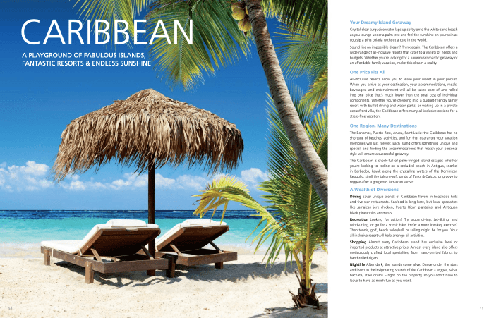
This travel brochure example features a large eye-catching photo that spreads across two pages and is designed to immediately transport readers to their dream vacation destination. It’s the perfect image choice as it’s simple, brightly colored, and shows off the natural beauty of the destination.
The bold title stands out, and the subheading concisely sums up the main features of the destination – using the rule of three for impact. The text on the right-hand side of the tourism brochure is divided into bite-size sections for readability, with clear subheadings which help the reader to skim the text and quickly jump to the parts that appeal to them the most.
2. This magazine-style travel brochure from Kuoni
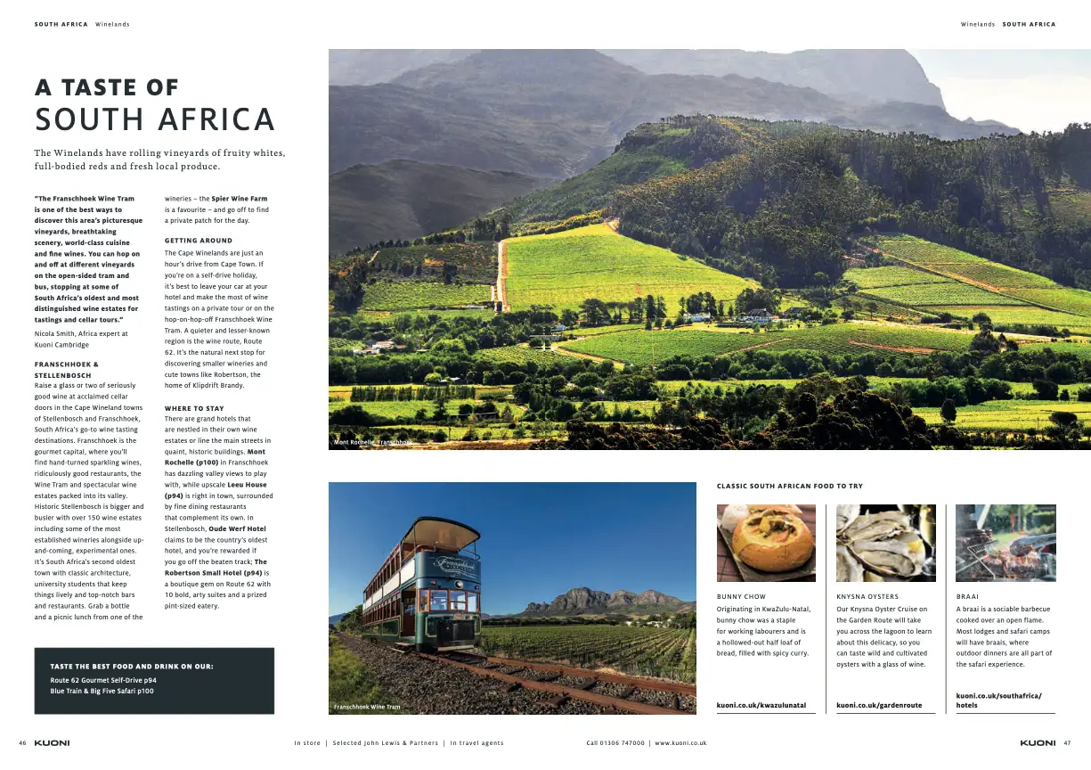
This travel brochure from Kuoni is formatted just like a magazine, featuring columns of text, stunning photography, and well-organized information to enhance the user experience. The magazine-style layout is a strategic move as it makes the content feel less like a direct sales pitch and more like an engaging and informative read.
Another clever tactic from this travel agency is the nod to other relevant pages. These clever signposts help readers navigate seamlessly through the brochure to other relevant content – and the more they know, the more likely they are to book!
Learn how to make a travel brochure in 6 simple steps
And discover the best practices you should follow to make your project a success.
3. This double-page splash from Avanti Travel
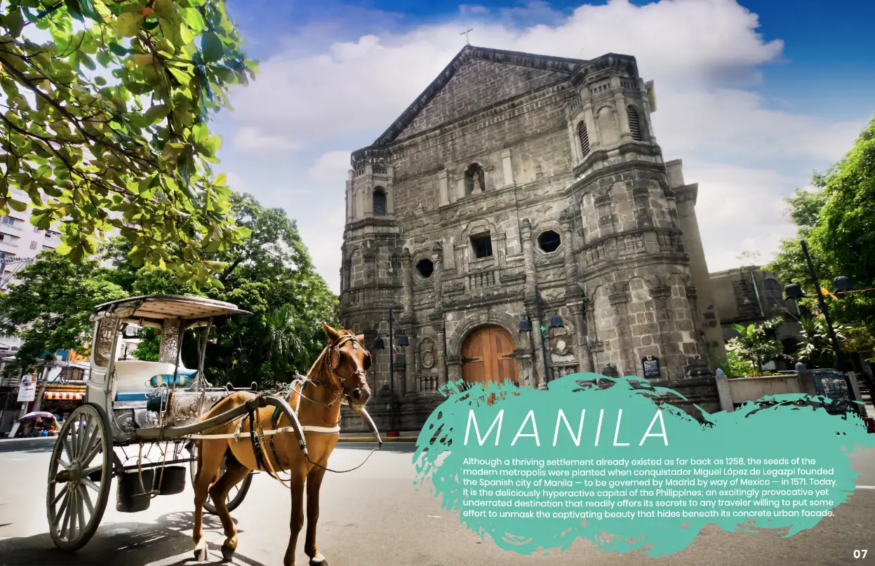
This double-page splash features one huge high-res image that perfectly sums up the destination and local culture, giving potential customers an immediate idea of what to expect from the location. The eye-catching text box stands out against the image, with a bold title followed by a well-written introduction to the capital city.
4. This information-filled travel brochure example from Titan Travel
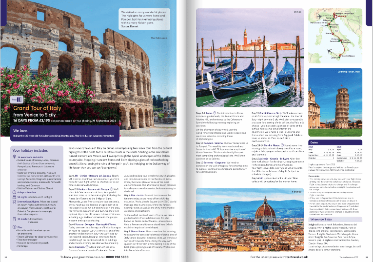
This brochure from Titan Travel aims to provide the reader with as much information as possible to help them make an informed decision about their next vacation. And while too much text can sometimes be overwhelming, this example balances things out with colorful images which give the brain some breathing space.
This comprehensive guide includes everything from itinerary and costs to accommodation information – quite literally everything someone needs to know before booking a vacation. Not only is this useful for the customer, it also means your travel agency is less likely to be bombarded with questions!
5. This minimalist travel brochure example from AAT Kings
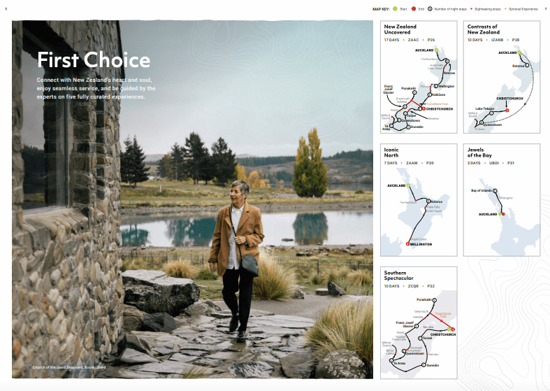
Information-filled pages are needed in travel brochures, but it’s just as important to balance them out with some pared-back pages too. This minimalist page design has a beautiful image as the main feature, with five clear maps showing the different route options. The maps in this example are color-coded and feature numbered destinations along the route, making them easy to read and follow.
Allocating a full page at the start of your travel brochure to summarize route or tour options is a smart move. It provides readers with a quick overview of what’s on offer, and lets them jump to the itinerary that appeals to them the most.
6. This visually appealing brochure by Liberty Travel
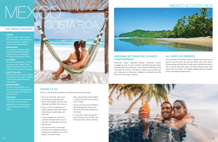
In this design, the double page is nicely divided into sections, with three strong images taking up the majority of the space. The images are all connected but different, and work effectively to transport the reader to the destination, helping them to visualize exactly what their holiday would look like.
The color-blocked section on the left-hand side helps to divide the text on the page, making it easier to read, and the font color contrasts beautifully with the blue background. On the rest of the page, the text is divided into clear and useful sections, highlighting key attractions and things to do. Plus, there are bullet points and columns to help the reader skim the copy.
7. This eye-catching travel brochure cover from Titan Travel
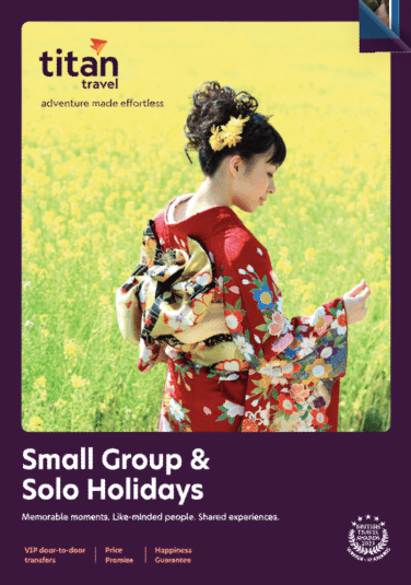
They say don’t judge a book by its cover, but quite frankly that’s exactly what customers are going to do. That’s why your front cover needs to be as eye-catching as possible, enticing travelers to pick up your brochure and open it up. Colorful images are a good choice for your travel brochure’s front cover, helping it stand out when stacked alongside dozens of others!
This well-designed brochure from Titan Travel uses a brightly colored image to attract attention. The front cover as a whole hones in perfectly on its target audience – the image shows that the holidays are rich with culture, and the text perfectly encapsulates three things that solo travelers are looking for when they book a solo holiday.
8. This well-balanced travel brochure design from Costsaver
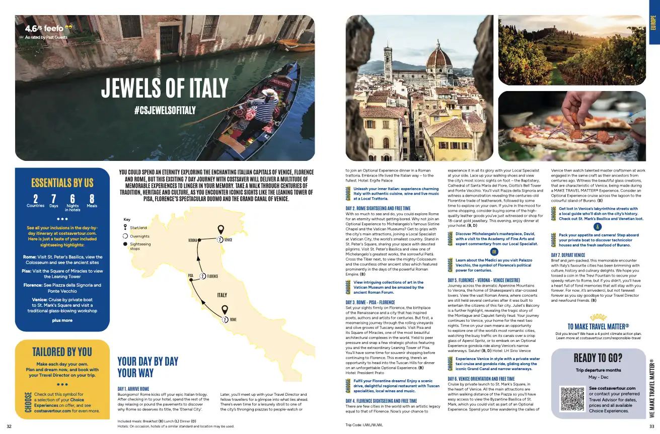
This travel brochure design strikes the perfect balance between simple and detailed, with the left-hand page featuring a simple summary and much more white space, and the right-hand page containing the more detailed information. It’s important to have this balance in mind when designing a brochure, thinking about text:image:white space ratio.
The key information is presented in a clear and simple way in a brightly colored text box, so that the reader can quickly see how many countries they’re visiting, how many days the tour is for, how many nights in hotels are included, and how many meals are included. Once they’ve read the summary, they’ll know whether this is the right trip for them, and can then decide whether to read the rest of the text.
Learn how to make a travel brochure in 6 simple steps
And discover the best practices you should follow to make your project a success.
9. This modern travel brochure example from Contiki
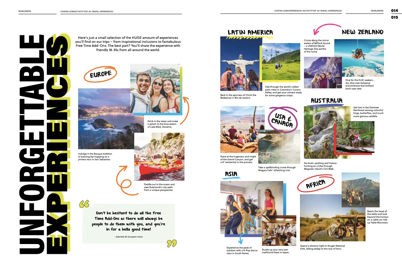
When you’re designing a travel brochure – or any other brand assets for that matter – your audience should be center stage in every decision you make. From color schemes and imagery to font choices and tone of voice, every aspect of your design should appeal to those that matter.
This modern travel brochure is a great example from Contiki. Bold, contemporary typography, user-generated content, and colorful doodles lend a fun and youthful tone to this travel brochure – perfect for the target audience of 18- to 35-year-olds. Using photos from previous tours gives the brochure authenticity, which is amplified with a positive testimonial too.
10. This picture-perfect travel brochure from Saga
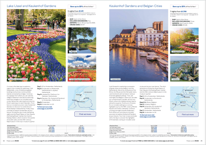
A picture speaks a thousand words, which is why imagery should be center stage in every travel brochure. Well-chosen, high-quality photos provide a glimpse of what travelers can expect, so it’s important to select images that represent the travel destination or tour accurately and resonate with your target audience.
Saga nails it with its approach, pairing stunning visuals with text in a visually appealing, symmetrical layout. All the information is clearly presented, with an easy-to-read day-by-day itinerary that gives readers a crystal-clear overview of what’s included in the tour. The use of bold and blue text draws attention to key details, so that readers immediately notice the most important information, even if they’re just flicking through.
If you’re looking to create a longer form of promotional content to offer your readers more relevant content about your business, check out these catalog examples.
11. This clearly-labeled travel brochure from Visit Idaho
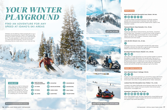
When you’re offering up a number of different tours, itineraries, and destinations, it’s a smart move to use labels to help customers identify the best option for them. In this travel brochure example from Visit Idaho, the icon key is clear and easy to follow, and it helps readers to quickly gauge exactly which activities are on offer in each destination
The images on this page showcase a variety of outdoor activities, and each image is usefully captioned to inform the audience about the specific activity or resort featured.
12. This calendar of events page from the official Niagara Falls USA travel brochure
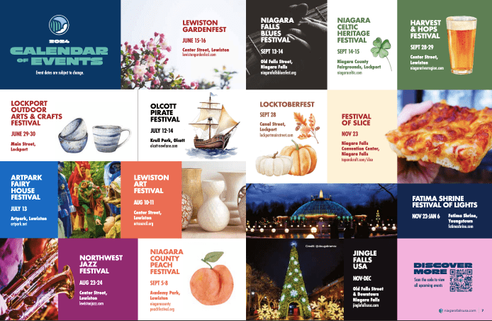
This colorful calendar of events page is a fun way of displaying upcoming events that might be of interest to prospective visitors. Readers of this print collateral can quickly identify events that take their fancy, and this encourages visitors to book a trip at that specific time of year.
See the QR code in the bottom-right encouraging readers to discover more? QR codes are a fantastic addition to travel brochures as they encourage visitors to stay on the user journey, providing them with additional information without overwhelming the brochure with text. By scanning a QR code, potential clients can access detailed itineraries, booking options, and relevant content (like a long-form blog post), making them all the more likely to book a trip.
13. This color-coordinated ad page from the official Maryland travel brochure
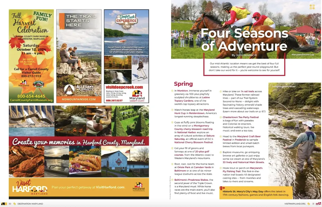
If you need to include ads in your travel brochure, then this is a great example of how to do it right. Maryland’s Office of Tourism has tastefully selected ads with a similar color scheme to sit on one page of their travel brochure. The same color scheme is carried across into their offer catalog and editorial page, creating a seamless flow that doesn’t jar the reader.
14. This simple travel brochure design from Authentik Canada
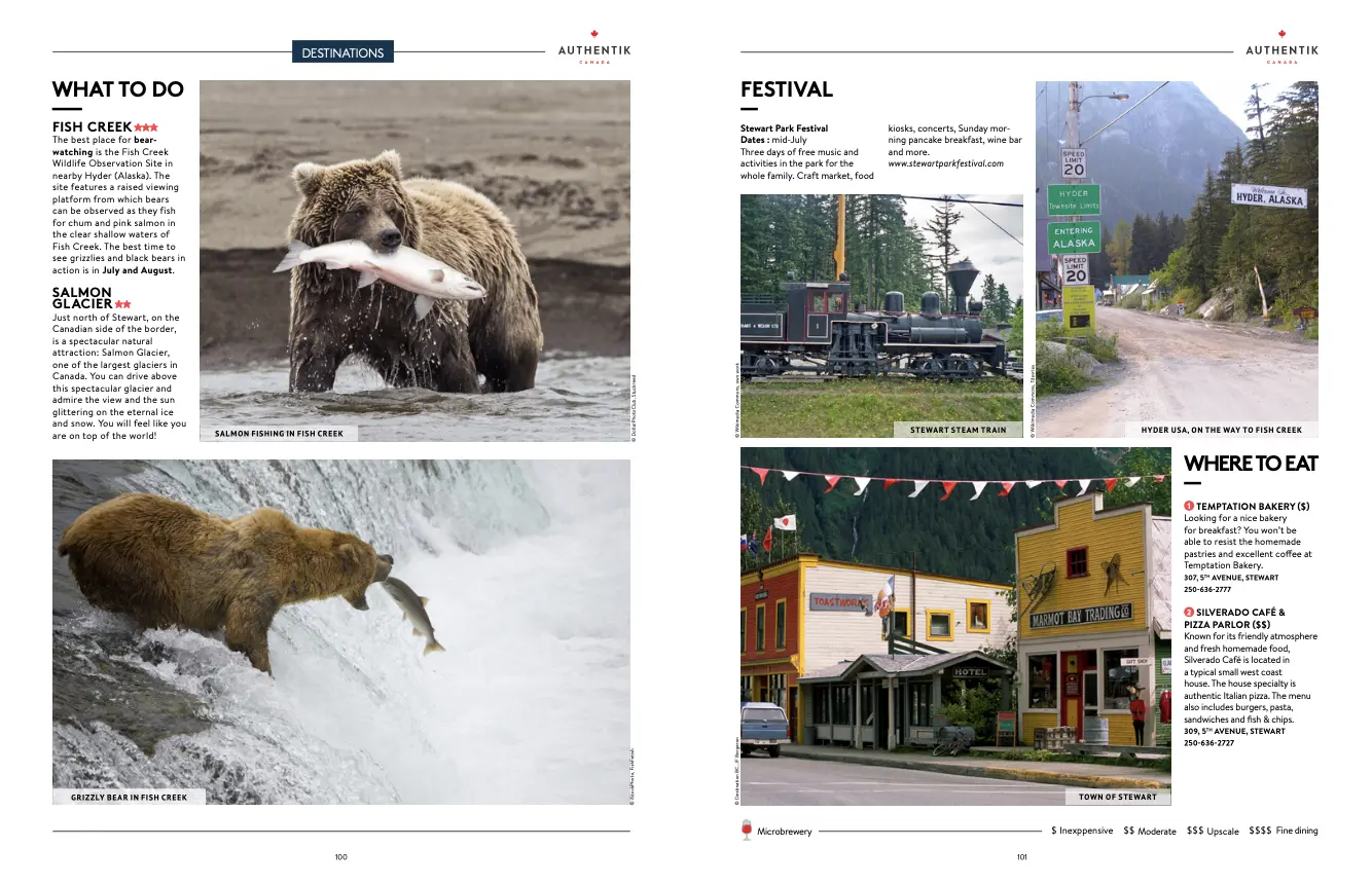
Sometimes, simplicity is best. This travel brochure from Authentik Canada opts for a clean, uncluttered design, with a plain white background that lets the imagery do the talking. Each photo is clearly but subtly captioned, providing essential context without detracting from the pared-back visual appeal.
The text boxes are nicely spread out and contain minimal text – enough to convey helpful information, but without overwhelming the reader. This thoughtful approach results in a brochure that is not only easy on the eyes, but also provides an enjoyable, straightforward, and relaxing user experience.
15. This tri-fold brochure design by Adobe
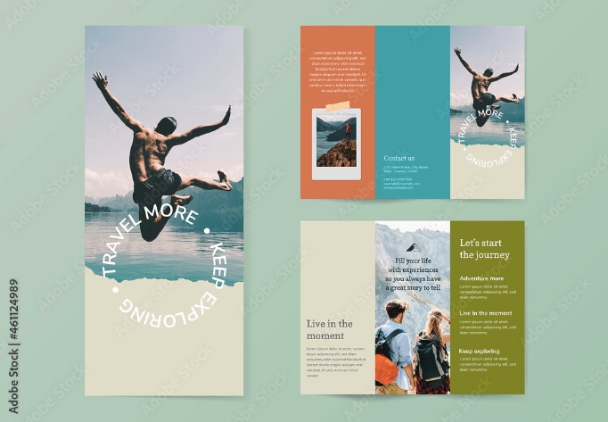
A tri-fold brochure is a great idea for informational displays where visitors need quick, accessible information about local attractions or tours. That might be as a part of a hotel advertisement, in an airport, or a tourist information center. It’s also a good idea to display these in travel agencies where space is limited, as they give potential clients a quick snapshot of travel destinations.
This trifold travel brochure template from Adobe is a good starting point, and demonstrates the power of striking imagery in capturing attention. It also shows how color blocking can be effectively used to divide information, and that less can often be more when it comes to volume of text.
Adobe has thousands of travel brochure templates to choose from – ideal if you’re not a professional graphic designer! Top tip: if you sign up for a free trial, you can download up to 10 free travel brochure templates (or other stock imagery to use in your travel brochures).
Five lessons you can take from these travel brochure examples
- Use eye-catching, high-quality images to take readers on a visual journey and transport them to the destination
- Organize information in bite-sized sections, with clear subheadings and bullet points to enhance readability
- Balance detailed text with visual elements and white space to avoid overwhelming the reader
- Keep your target audience in mind throughout the design process
- Use signposts like page references and QR codes to keep customers on the user journey
Final thoughts
I hope you’ve enjoyed browsing these travel brochure examples and have come away feeling inspired and ready to get started on your next brochure design.
A fundamental part of the travel brochure design process is review and approval. After all, you need to get the right eyes on your designs to make sure everything is accurate, on-brand, and error-free before you go to print or publish it online.
Design approval software like Filestage helps to make your feedback and approval process quicker, easier, and more collaborative. To see for yourself how Filestage can help, start a free trial →


