
Billboards are intended to reach a massive audience, with nearly 80% of consumers engaging with an OOH ad in the past 60 days. So the stakes are high when it comes to the creation process. A great billboard needs to create a big, impactful moment and it needs to do it fast (in six seconds or less, to be precise). Challenge accepted.
In this article, I’m going to share eight steps to help you create a billboard design that turns heads and wins hearts. I’ll share a few of my favorite examples along the way too.
Here’s a quick snapshot of how to structure your billboard creation process:
- Define your audience and objective
- Look for the big idea
- Keep your message simple
- Opt for high-quality visuals
- Use bold and contrasting colors
- Tap into the power of typography
- Consider location and placement
- Review and refine your design
Now let’s look at how to implement each step into your design workflow.
1. Define your audience and objective

Image source: Billboard insider
All the striking visuals and snappy copy in the world won’t matter if your billboard doesn’t have a clear purpose from the start. Your purpose should ultimately guide all creative decisions and help you design the best billboard for your brand.
First, you want to define exactly who you’re talking to. And I don’t just mean a general demographic. Dig deeper into your audience’s everyday experiences, preferences, and pain points. The more you know about your target audience, the greater chance you have of grabbing their attention and staying top-of-mind.
Next, pinpoint the single most important thing you want to achieve with your billboard ad. Do you want to drive sales for a new product? Get more people to try your app? Boost brand awareness? Resist cramming more than one objective into your billboard design, as it’ll muddy the waters when it comes to crafting your messaging.
In short, my advice at this stage is to ask the right questions now and bypass the need for any guesswork down the line.
Supercharge your marketing reviews
Share content, get feedback, and manage approvals with Filestage.
2. Look for the big idea

Image source: ADWEEK
Okay, so not all outdoor advertising is built on a clear concept, but the most memorable ads definitely are. So you don’t want to rush this part of your billboard design process.
Your main objective (see step one) will form the basis of your billboard concept. Think about what you want to achieve. Look at how you can dramatize the consumer’s problem or the solution your product brings in a unique, engaging, or relatable way.
Coming up with a strong idea now will make it much easier to write compelling copy and create eye-catching visuals later. On top of that, it will help your billboard design leave a long-lasting impression on your target audience.
If your billboard is part of a wider campaign across other media, you’ll likely already have a concept in place. In that case, you’ll need to focus more on how you can translate the idea into a quick, high-impact billboard ad.
Spoiler: You’ll most likely need to simplify your idea down, using shorter copy and bolder visuals.
3. Keep your message simple
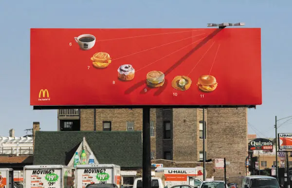
Image source: ALLEBACH
The three-second billboard rule says that audiences should be able to absorb your billboard’s message in three seconds or less (and honestly, I would say that’s on a good day). So keep it simple.
When crafting your messaging, aim to:
- Use as few words as possible – 7 words or less is the goal (for the headline + call to action)
- Stay single-minded – Say one thing and say it well. Easy peasy (actually not that easy, but so worth it)
- Avoid clutter – There’s no room for lengthy body copy or fine print here
When you’re deep in the creative copywriting process, it can be harder to judge whether your message is concise enough for the average Joe on the street. So try showing your billboard message to friends or family for three seconds. If they don’t immediately get it, it’s too complicated and needs more consideration.
4. Tap into the power of typography
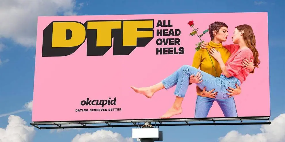
Image source: DESIGNRUSH
Typography can sometimes be pushed to the bottom of the priority list in graphic design. This is a silly mistake to make, as the fonts you choose speak volumes about your brand and can even make your ad more memorable.
Fonts generally fall into these four categories:
- Serif – Traditional and formal, serif fonts convey trust and reliability. Examples include Times New Roman and Georgia.
- Sans-serif – These fonts are modern, clean, and easy to read. Examples include Helvetica and Arial.
- Script – Elegant and personal, script fonts add sophistication to a design. Examples include cursive fonts like Brush Script and Lobster.
- Display – These fonts are big and bold, designed to make a statement. Examples include Impact and Bebas Neue.
Don’t be afraid to explore new creative possibilities by mixing and matching your typefaces. You could even create your own custom font to bring your billboard concept to life. Just make sure it aligns with your brand identity, then have some fun with it!
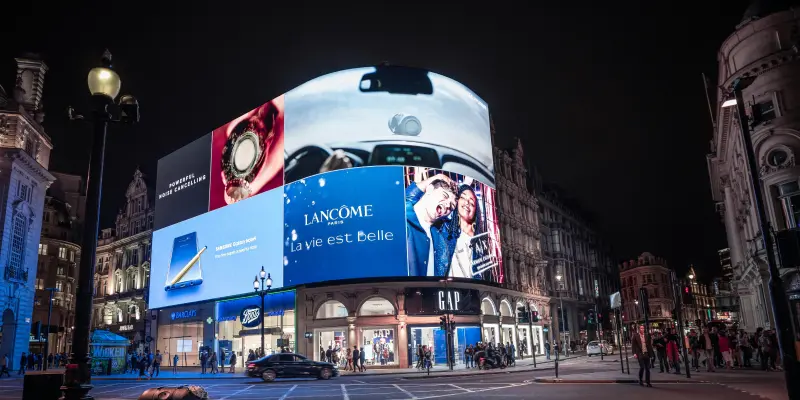
5. Opt for high-quality visuals
Image source: Look
Imagine pumping a load of budget into your billboard ad, only to realize that the visual glitches or falls flat once it’s live. Nightmare!
To avoid this, start with the basics. If you’re using imagery of any kind, make sure it’s high resolution. And if you’re working with DOOH advertising, test your design to make sure there’s no pesky pixelation in there.
You’ve also got to think about the way people see your ad. They’re likely passing by pretty quickly, either rushing to get somewhere on foot or driving along a highway. So you want your billboard to be immediately eye-catching, even from a distance.
6. Use bold and contrasting colors

Image source: alpha.one
Now, let’s talk color. It’s another factor that can help your advertising design catch people’s attention in a crowded space. The rule of thumb here is to go bold and ramp up the color contrast between the different elements in your billboard.
Here are a few quick tips for adding oomph to your outdoor advertising with color:
- Make text and visuals pop – As an example, black text on a yellow background or white text on a dark blue background will be easier to read from a distance.
- Limit your color palette – Too much color can actually be a bit off-putting. So stick to two or three main colors to keep things striking and cohesive.
- Use color to direct the eye – Be tactical. For example, make your call to action (CTA) button or phone number stand out by using a color that contrasts with the rest of the design.
Of course, you can always bend the rules and get experimental with your color choices. If you have an idea that helps your design stand out even more, give it a shot and share it with your team.
Another handy tip I just came across: Test the contrast of your billboard design by zooming out from your design to simulate how it might look to your audience. Does it still stand out? Is it readable? If not, it’s back to the drawing board.
7. Consider location and placement

Image source: New York Magazine
Billboard advertising is all about reaching lots of people in a high-traffic location. You want as many people to see your ad as possible. But it’s not just a game of numbers.
The quality of views matters just as much as quantity (if not more).
Your ad should be placed where your target audience is most likely to see it and connect with the message. That really is the key to persuading more passersby to take action.
Location also plays a big role in making your ads more effective. So if you’re running billboards in specific areas, think about how you can tailor your tone and message to create appropriate content that hits home for the community.
8. Review and refine your billboard design
Supercharge your marketing reviews
Share content, get feedback, and manage approvals with Filestage.
Whether you’re making a traditional, digital, or 3D billboard, you need to review and refine your design before it goes live. This is the only way to make sure that your design is clear, impactful, and free from any mistakes.
Chances are your teammates will have lots of feedback on your billboard design. Which is great, but it can also get a bit (a lot) chaotic. That’s where Filestage comes in.
Filestage is a review and approval tool that makes it easy to share files, gather feedback, and keep track of changes. You can use it to review all the main file types (design files, PDFs, photos, the works), so it’s the perfect platform to make sure every element of your billboard is on point.
Here’s how to review and refine your billboard design in six steps:
- Sign up for free and create a project
- Set up review steps and invite reviewers
- Upload files and set due dates
- Collect feedback from reviewers
- Refine and upload new versions
- Repeat until final approval
Once your teammates (and client, if you’re in an ad agency) are happy with the billboard, you know you’re onto a winner.
Final thoughts
The best billboards might look stunningly simple, but there’s a lot of time, thought, and hard work that goes on behind the scenes. And it’s worth every bit of it.
I hope this article inspires you to design some outstanding billboard ads. And if you’d like to send every billboard out into the world with confidence, give Filestage a go. You can request your free trial here→