We’ve written a fair bit about great packaging designs here at Filestage. We’ve spotted hot packaging design trends, soaked up lots of inspiration, and awed at some stunning sustainable packaging ideas.
But you know what? Finding out what not to do when designing your product packaging is just as important as all of that. It’s also way more entertaining (you’ll see what I mean in a minute).
So brace yourself as we rummage through these eight bad packaging designs. And don’t worry, I’ll share lots of tips and constructive feedback along the way, so you can avoid making the same mistakes.
Let’s go!
1. Misleading outer packaging
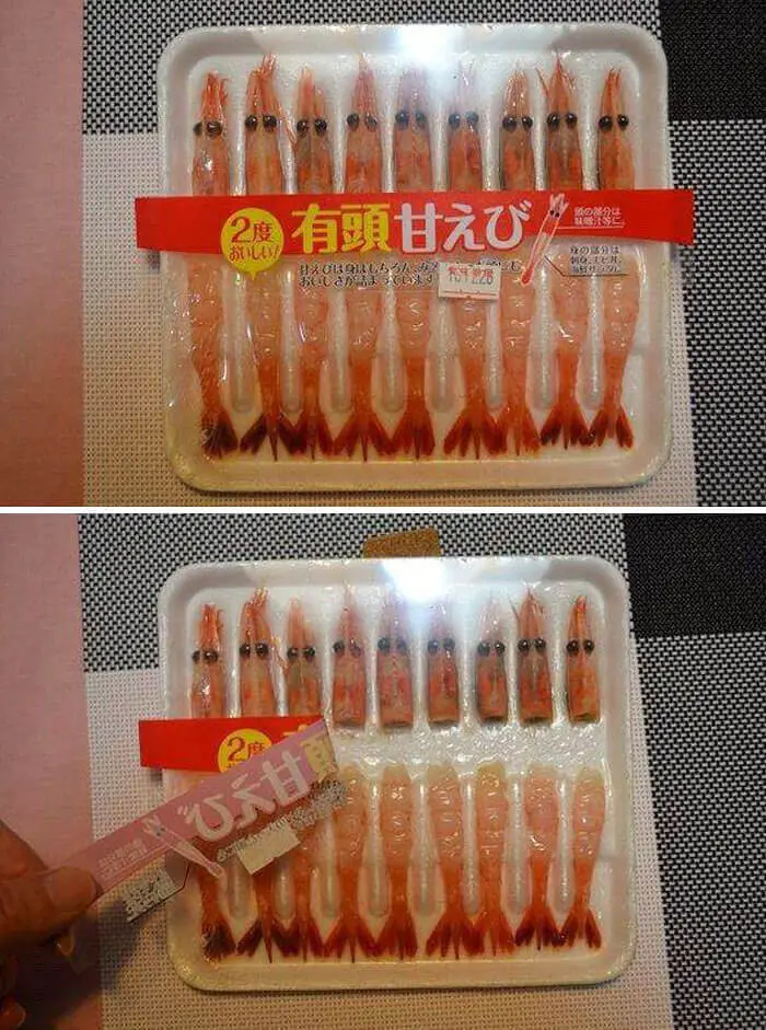
Image source: The Fun Post
From half-empty packets of potato chips to deceptively large skincare bottles, brands have been pulling all sorts of tricks to create the illusion of value. But it’s a real no-go if you actually give a damn about customer loyalty.
While you’ve got to chuckle at this skimpy shrimp packaging (where the label hides reality), you probably wouldn’t be laughing if you were a customer who just spent money on the product. Chances are, you’d feel pretty cheated.
Misleading product packaging is an incredibly short-sighted marketing move. Sure, it might increase your profits at the start, but it will almost certainly come back to bite you later down the line.
Instead, your packaging design process should always aim to build trust and satisfaction among your customers. So focus on both transparency and honesty, by accurately showcasing your product’s size, quantity, and quality. In a marketplace filled with lofty promises, honest packaging could be one of your strongest marketing tools.
The fast way to get feedback on packaging
Get clear and collaborative comments right on top of your packaging artwork.
2. Misleading product photography
Image source: String Lab Creative
Much like misleading packaging size, false advertising in your product photography is another big no-no when it comes to your packaging design.
I know, product shots are meant to be appetizing. It’s a tool that can help you entice new customers and make more sales. But there’s a line. And this mooncake packaging has well and truly crossed it.
At the end of the day, your customers expect the product they buy to match the images they see on the pack, and failing to meet this expectation will only result in negative reviews and loss of customer loyalty. Plus, it can get dangerous if you’re working with medicine packaging design.
Instead of enhancing your product images to the point of being unrecognizable, you should be aiming for accuracy as well as appeal. By this, I mean making the image on the box matches what you’re selling.
Of course you want to show your product in the best light, but just make sure it’s still a truthful representation and not one that creates an illusion for your customer. This will build trust and set realistic expectations from the start, ultimately leading to happier customers and a stronger brand reputation.
3. Choosing the wrong type of packaging
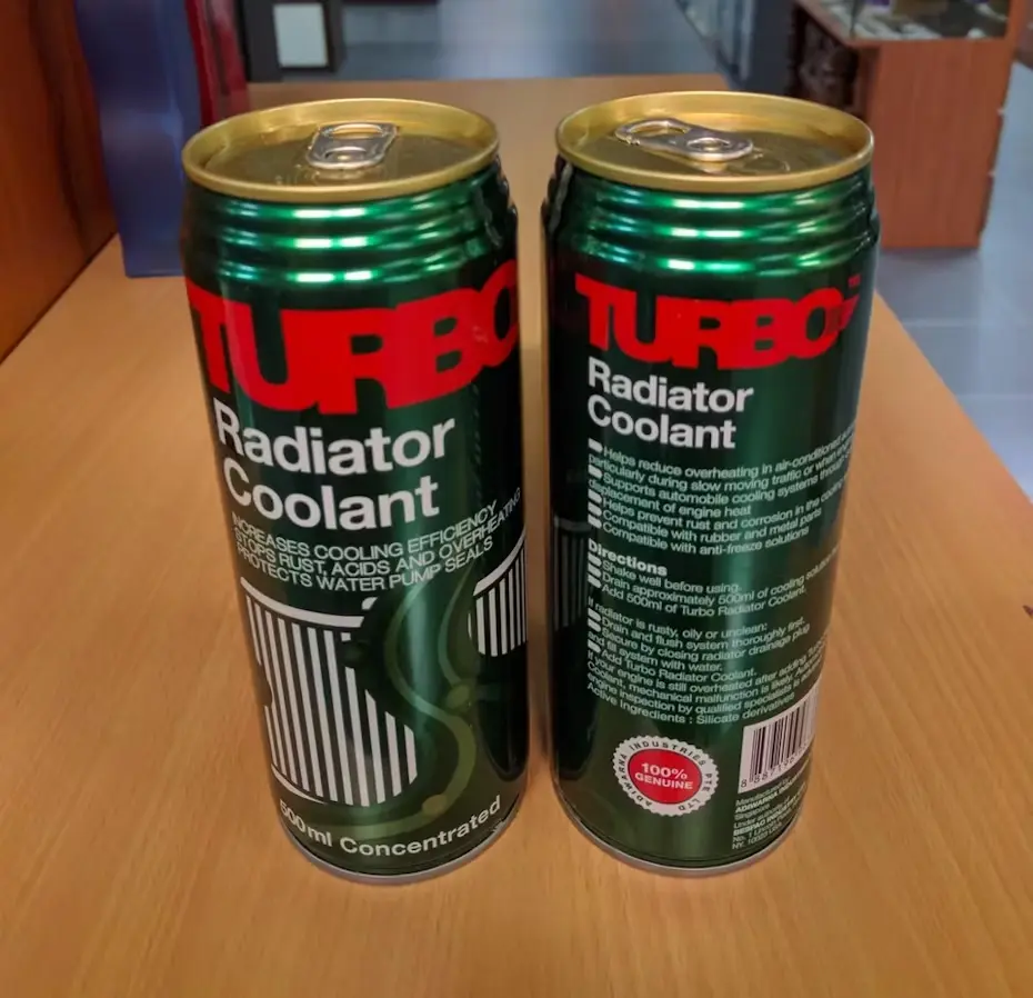
Image source: 99 Designs
From misleading to downright dangerous. This radiator coolant can is an extreme example of what can happen when you make poor packaging design decisions, since cans like these are widely recognised as drink packaging. Yikes!
And while choosing the oddly-shaped containers for your product might not be a health risk like this one, it can have serious repercussions for your product branding.
Packaging is often the first physical interaction a customer has with your product. So, using the wrong packaging or container has the potential to turn customers off your brand for good.
Before you even think about fonts, graphic design, or any other packaging design elements, you’ll want to put the time into choosing the right kind of packaging that works perfectly for your product and your brand values.
Ideally, this process will involve testing and listening to customer feedback, to ensure your packaging is practical, sustainable, and in line with regulatory standards.
4. Excessive packaging
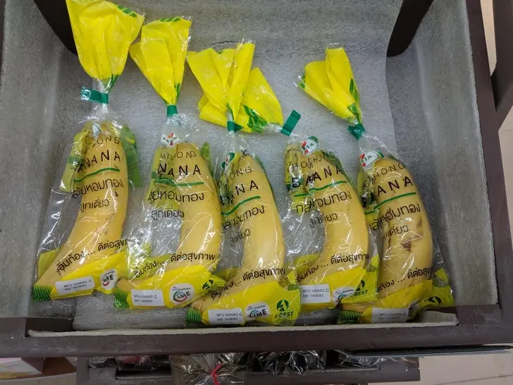
Image source: BLL
As a kid, I had a neighbor who would make a point of going into our local grocery store and removing excess plastic packaging from different products before buying them. This was the first time I ever even considered how pointless most plastic packaging really is!
The point is, excessive packaging not only contributes to environmental waste, it also frustrates consumers who care about their ecological footprint. And while businesses are becoming more eco-conscious, we still see too many examples of careless and excessive packaging in consumer packaged goods.
When designing product packaging, you have a responsibility to make more environmentally friendly choices. So think about how you can optimize your product packaging design to use only what is needed to protect it.
There’s also a bunch of eco-friendly materials out there that you can work with, from plant-based plastics to reusable containers, and everything in-between. Shop around and you might even be able to get eco materials for the same price as traditional packaging!
If you want to position your brand as the top choice for customers, start by stripping back your packaging and choosing the right materials. Use a normal size box (nothing bigger) and avoid individually wrapped items wherever possible!
Check out these creative food packaging examples for inspiration.
5. Font fails
Image source: Ranker
This bad packaging design really shows the value of working with a professional designer!
During the packaging approval process, teams often underestimate the impact their font choices can have on the overall impact of their design. Whether you’re working on a new packaging, a brochure, or a poster, you need a professional designer on your team. Because, as we can see, this kind of oversight could be a costly mistake.
There’s a lot to consider when incorporating a font into your packaging design. You need to think about what the font you choose says about your brand, striking the balance between showing personality and being too over-the-top. Then there’s legibility, font spacing, hierarchy, and lots of other elements to factor in too.
To steer clear of any font fails in your packaging, I’d suggest taking the time to consider all the elements above, and how they’ll come together in the real world. This will save you a whole lot of hassle (or, in this case, embarrassment) down the line.
Oh, and always remember to prioritize readability and consistency. After all, the messaging in your packaging design has a job to do. And if your packaging can’t convey crucial information about your product, you’re off to a bad start in the eyes of your audience.
6. Poorly placed cut-outs
Image source: Ranker
Now, don’t get me wrong. I’m a big fan of cut-outs in packaging, as they’re a great way to showcase the quality of your product and build trust among your audience. But only when they’ve been properly tested and checked for any … eh … mishaps.
Poorly placed cut-outs can lead to a whole host of problems, undermining your marketing efforts and potentially even damaging your brand’s reputation.
Here are just a few of the things you need to think about when incorporating cut-outs into your packaging design:
- Product visibility
- Structural design
- Safety issues
- Brand consistency
When designing packaging with cut-outs, it’s super important to ensure they’re strategically placed to enhance the product’s presentation without compromising its protection.
Testing how your products work within the packaging is of course the best way to make sure everything’s up to scratch by the time you hit the shelves.
Gather some inspiration with these creative box design ideas.
7. Packaging that’s hard to open
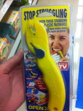
Image source: Unified Manufacturing
Clamshell packaging, where the product comes packaged in a hard case (usually made of plastic), offers some heavy duty protection for products. But let’s be honest, it’s an absolute pain to open.
But clamshells aren’t the only culprits. In fact, there are lots of creative ways to put the pain in opening product packaging. I’m sure you’ve come face-to-face with some pesky mechanisms yourself.
Needless to say, frustration caused by faulty opening designs can create pretty crap customer experiences. They can even lead to injuries from sharp edges or tools used to cut through the packaging.
On the flip side, there’s a variety of ways to make it easier for customers to use your product. For example, you could incorporate tabs, tear strips, or perforated lines into your packaging design.
You can really get innovative with your opening mechanism, as long as you stay laser-focused on elevating your customers’ experience.
8. Unoriginal packaging
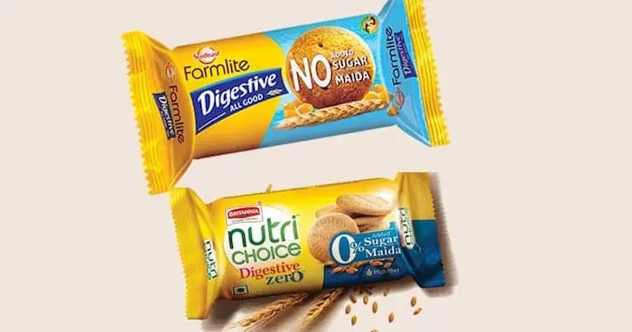
Image source: Crowd Spring
While a lot of bad packaging examples stand out for the wrong reasons, generic product packaging isn’t the way to go either.
That’s not to say you can’t take inspiration from some packaging design trends. But unoriginal packaging will likely fail to catch people’s attention and make your product blend into the background. Which is the exact opposite of what your product packaging strategy is supposed to do!
Rather than following the crowd, focus on your brand identity and your product’s unique selling points. This is how you’ll create product packaging that’s unmistakably yours.
Review your packaging designs with Filestage
What do all dodgy packaging designs have in common? Most likely, a lackluster review process.
Creative review processes can be broken for a bunch of different reasons, whether it be a messy review workflow, scattered feedback, or missed quality checks. And the best way to nip all these problems in the bud is with a label design software like Filestage.
Filestage works by bringing all your files, feedback, and updates together in one place. You can invite as many reviewers as you need, track project progress, and make sure everyone’s happy before your designs go out the door.
Here’s how it works:
- Sign up to Filestage for free
- Create a project and upload your files
- Create Reviewer groups and invite reviewers
- Turn feedback into an actionable to-do list
- Repeat as needed and approved with a single click
The streamlined review workflow means you can create and launch all your packaging designs (and any other projects you’re working on) with confidence.
The fast way to get feedback on packaging
Get clear and collaborative comments right on top of your packaging artwork.
Final thoughts
There’s a lot that to learn from these bad product packaging designs. But really, what it all boils down to is taking the time to review your packaging and make sure it’s ready for the big, bad world.
I hope you’ve enjoyed reading this article about bad packaging design. If you’d like to have a laugh at more marketing howlers, check out these cosmetics advertising fails.
And if you’d like to see for yourself how Filestage can help you create your best product packaging, go ahead and start your free trial today.