In brand communication, every little detail counts. Whether you’re debating the right shade of color to use for the logo, the wording for your next slogan, or the best fonts for future ads – it all matters in advertising.
And choosing between Helvetica and Times New Roman makes a difference in how your audience will perceive your brand.
To make sure your next ad accurately represents the brand and helps you deliver the right message to the readers, you should dive into a range of font families and see which one works best for you.
Let’s look at the 10 best fonts for ads that will make your next ad stand out!
Supercharge your marketing reviews
Share content, get feedback, and manage approvals with Filestage.
Serif vs. sans serif fonts
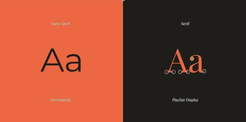
Whether trying to paint a more romantic or bold picture, you’ll first look at which font category is best for your message. The biggest difference between these two font categories is that serif fonts contain decorative strokes on the letters’ ends and edges, unlike Sans serifs.
As the name suggests, sans serif fonts don’t have this stroke at the end of the letters and portray a cleaner and more modern look.
Source: canva.com
Serif fonts
Because of the strokes on the ends and edges of the letters, serif fonts often look more elegant and traditional. To help you get a clearer picture of what serif fonts look like, I’ll just say that the most well-known example of serif fonts is Times New Roman.
In advertising, serif fonts are mainly used for logos and shorter messages.
Here are the five best serif fonts for ads:
1. Trajan
Trajan is a serif typeface created in 1989 by Carol Twombly for Adobe. The font is inspired by Roman square capitals, which gives it a monumental look. You’ll often see this font on movie posters and book covers.
And if you’re still struggling to imagine what this font looks like for commercial purposes, I’ll just say that the Sex and The City famous pink poster with sequences has the name of the movie written in Trajan font.
Since the font is pretty standard, it won’t be the most creative choice, but its bold features and straight lines will help you clearly deliver the message to the readers.

Source: companyfolders.com
2. Minion
Minion is another one of the Adobe fonts first released in 1990. This font was inspired by the Renaissance era and designed to make copies easier to read. Since the font has a retro feel, you can mostly see it on book covers of mystery novels or some classical music concert announcements.
On top of that, Minion was created for longer body text, making it ideal for advertising material that requires readers to consume more text. So if you’re looking for a more subtle choice to remind readers of the olden days, this is the right font choice for you!
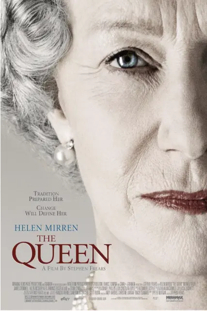
Source: fontmeme.com
3. Copperplate
Copperplate is an example of a more modern and edgier look for serif fonts. It was designed to revive the American classic Copperplate Gothic and was initially released in 1902. Since the font only exists in capital letters, it is mainly used for logos and headlines in advertising.
This font gives out strong, powerful, and confident energy, which makes it great for advertising such brands. So if you’re making an ad for a new hotel, upmarket restaurant, or a rich wellness retreat, the Copperplate serif will be the right font for the occasion.
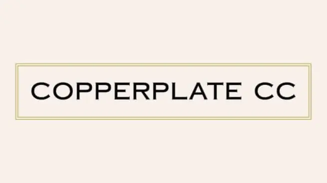
Source: befonts.com
4. Mafins
As we progress through the list, we’re arriving at more and more modern examples of serif fonts. Mafins is a stylish and elegant example of a serif font that combines tick lines with decorative strokes characteristic of this group of fonts.
What’s great about Mafins is that it’s adaptable to almost any size, which makes it suitable for titles, subheadings, or even longer copies.
If you’re looking for a slightly quirkier look and feel for your next ad, Mafins might be the right typeface for you.
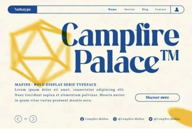
Source: befonts.com
5. Monalisa
The Monalisa serif font is both elegant and unique at the same time. It can make your ad look more thought of and fashionable while keeping it clean and clear. Monalisa is perfect for logo design, branding projects, clothing branding, or magazine titles.
This typeface also offers a range of alternatives for making your ad completely unique. If you wish to keep it classic, you can always stick to the original font and create a beautiful and clean ad.
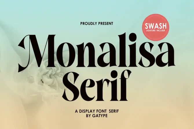
Source: dafontfree.com
Supercharge your marketing reviews
Share content, get feedback, and manage approvals with Filestage.
Sans serif fonts
Without the serifs at the ends and edges of letters, sans serif fonts look more modern and clean. These fonts are often popular among brands since their simpler look makes them easier to read on screen. Plus, you will find more versatile fonts among sans serifs.
Here are five most popular sans serif advertising fonts:
1. Helvetica
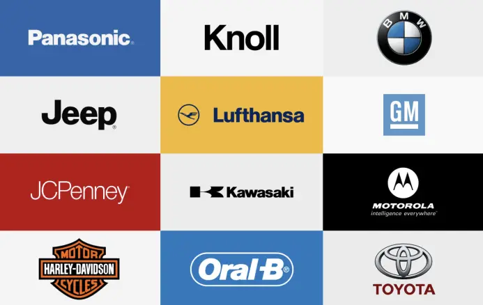
Helvetica is one of the design market’s most popular sans serif typefaces. It was designed by Max Miedinger and Eduard Hoffmann in 1957 and belonged to the neo-grotesque designs. Since its initial release, numerous brands have used Helvetica for their logos and copy ads.
Source: graphicpear.com
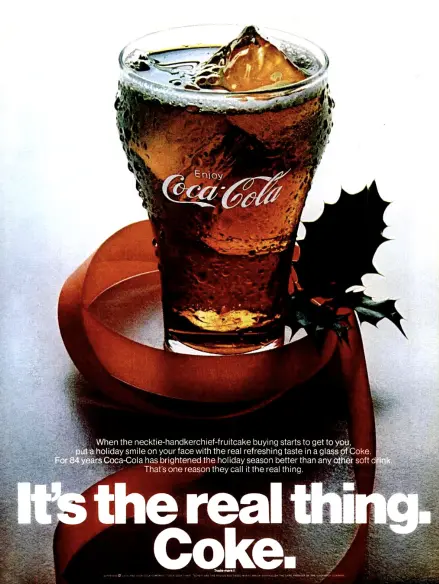
Its simple yet powerful look gives a brand the feeling of stability and timeless presence. Helvetica can be the right font if you’re doing a logo redesign for a well-known brand or sending out a powerful message in your ad.
There’s even a documentary about fonts, graphic design, and typography named after this famous font!
Source: fontsinuse.com
2. Univers
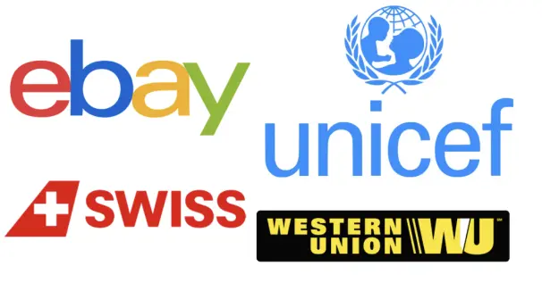
Univers is a large sans serif font family designed by the famous designer Adrian Frutiger and released in 1957. Univers is mainly known for its stripped-back look and for making the content easy to read. Some of the most recognized brands that use this font for their logo are eBay, Unicef, and FedEx.
Similarly to Helvetica, this font is great for longer ad copy or logo redesign for timeless brands. In the last couple of years more and more big and famous brands redesigned their logos with fonts like Univers and Helvetica. These more “simple-looking” fonts help them communicate timeless presence.
Source: zenbusiness.com
3. Futura
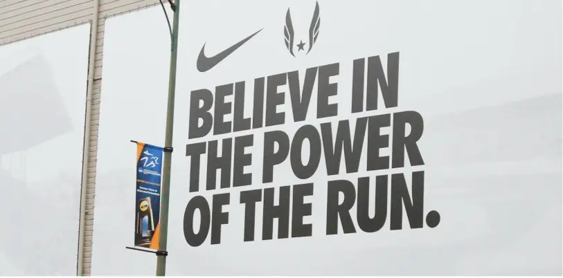
Futura is a geometric sans serif font designed by German designer Paul Renner and released in 1927. The font came to life as a contribution to the New Frankfurt project. It’s based on geometric shapes, especially the circle, which was in the spirit of the Bauhaus design style of the period.
Futura’s round shapes scream modern, elegant, and relevant all at the same time. Its extra bold typeface is even considered a mother of all brands. So if you’re sending a powerful message with your next ad, you should try the Futura font.
Up for a test? See if you can spot which of our best car ads features this font!
Source: extensis.com
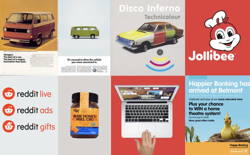
4. VAG Rounded
VAG Rounded is a modern geometric sans serif font family that comes in eight different styles. The original typeface was commissioned in 1979 as a new corporate font for Volkswagen AG.
Over the years, VAG Rounded fonts gained increasing popularity beyond the Volkswagen design. This can be attributed to their geometric letterforms, which make the design feel friendly and approachable.
So if you’re portraying a more playful picture of the brand for your next ad, VAG Rounded will be the perfect font for the occasion. It also works for POS marketing materials like these creative examples.
Source: medium.com
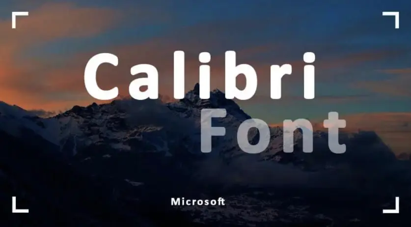
5. Calibri
Calibri is a digital sans serif typeface family in modern style. It was designed by Luc de Groot and released to the general public in 2007 as a part of Microsoft Office 2007. Since then, the font has made it big in the digital space, being the default typeface for all Microsoft products until 2021.
As the brand moves on to the next default fonts, this subtle, readable, and light typeface stays in the background waiting for more hipster graphic designers to adopt it. It’s just a matter of time before Calibri makes a big comeback in the advertising world, so make sure to jump on that bandwagon in your next ad.
Source: freefontsvault.com
What are slab serif fonts?
Even the biggest names in graphic design can only partially classify slab serif fonts against serif and sans serif fonts. Based on their looks, most slab serifs are somewhere between serif and sans serif fonts and leaning closer to sans serifs.
Their bold, rounded presence and occasional serifs make these decorative fonts particularly interesting for online advertisements.
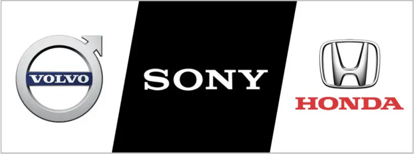
Here are the three most famous examples of brands using slab serif typography in their logos:
- Honda
- Sony
- Volvo
Source: threerom.com
And remember, if you want to keep your branded assets consistent, be sure to make your fonts easily accessible in your press kit.
How to speed up client feedback on new fonts
Without efficient collaboration, it can be exhausting to work on new fonts for your clients. With a client feedback tool like Filestage, you can have your review process basically run itself, waving goodbye to sleepless nights of waiting for someone’s feedback.
Filestage allows teams to share, discuss, and approve all their files, all in one place – including documents, images, videos, websites, and audio files. Plus, all reviewers will get notified whenever there’s a due date approaching, making sure you collect all your approvals in time.
Final thoughts
For anyone who has yet to pay more attention to the world of fonts, it can be overwhelming to spot differences and implicit messages of each font.
Hopefully, this article covers the basics and helps you dive deeper into the colorful and exciting world of typography and advertising fonts.

