Banner ads have been a cornerstone of online marketing since the early days of the internet. Countless other tactics have come and gone, but banner ad campaigns have stood the test of time. And for good reason!
These versatile digital billboards continue to offer businesses a cost-effective way to a) reach a vast online audience, b) boost brand visibility, and c) deliver targeted messages.
But in an oversaturated online environment, where competition for consumers’ attention is fierce, it’s more important than ever to create banner ads that stand out from the crowd.
With that in mind, I’ve rounded up 21 of the best examples of successful banner advertising, broken down by type, with an in-depth look at exactly what makes them so effective.
But first of all…
What are banner ads?
A very good starting point indeed. Banner ads are a type of online display advertising. They are rectangular in shape, typically contain a combination of text and graphics, and are usually placed at the top, bottom, or side of web pages.
Banner advertisements are used to promote products or services, and when clicked, they drive visitors to a specific landing page on your website.
Supercharge your marketing reviews
Share content, get feedback, and manage approvals with Filestage.
What makes a good banner ad?
Let’s take a look at the key characteristics of effective banner ads.
- Clarity – The message of banner ads should be clear and concise, and viewers should immediately understand what the ad is promoting or offering.
- Relevance – Banner ads should be super relevant to the target audience, addressing their needs and interests.
- Eye-catching design – The display ad should stand out, with the use of attention-grabbing visual elements such as striking images and bold colors.
- High-quality imagery – The best banner ad designs feature high-resolution images or graphics. Poor-quality visuals can detract from the ad’s impact.
- Strong call to action (CTA) – The banner ad should include a clear and compelling CTA that encourages viewers to take a specific action, such as clicking the ad, signing up, or making a purchase.
- Minimal text – Keep the banner ad copy concise and to the point. Too much text can overwhelm the viewer and reduce the ad’s effectiveness.
- Branding – Your banner ads should include your brand’s logo and maintain a consistent look and feel with your overall branding to reinforce brand recognition.
The best leaderboard banner ads
Leaderboard banner ads are the wide ads typically found at the top of web pages. Their strategic placement right at the top of the page means they’re one of the first things a user sees when visiting a site – hence their popularity as a digital marketing tactic!
Here are some of the best banner ad examples I’ve seen.
1. Chanel’s luxurious banner ads

Perfume adverts are famously dramatic and impactful, and this successful banner ad from Chanel is no exception. With an eye-catching and aspirational combination of product and lifestyle imagery, the audience is instantly transported to a place of luxury that’s so synonymous with the brand. The logo is clearly displayed, the product name featured in a playful font, and there’s a clear call to action, enticing site visitors to discover more about the luxury perfume.
2. This colorful ad from Wired

In a sea of ads, bold and bright colors can help banner ads to stand out from the crowd – as this banner ad from Wired clearly shows. The use of four contrasting colors is quick to grab your attention, making you take notice. Add powerful messaging and a clear call to action to the mix, and you’ve got a recipe for success.
3. This comical banner ad from Amazon Books

Amazon has nailed it with this banner ad – and the longer you look at it, the funnier it gets. There’s layer upon layer of comical content, from the cartoon eyes and the bubble font to the commentary and the avatar, all highlighting the inner monologue of the reader. The messaging is appealing and inspiring, and it’s an innovative way of encouraging people to pick up a book.
4. McDonald’s mouthwatering banner ad

McDonald’s is renowned for its marketing campaigns, and this banner ad is another good example of their marketing team’s magic. It’s super simple, with product photography taking center stage against a dark backdrop. Then the brand’s signature golden yellow is used in a way that seeps into and echoes around your subconscious as you look at the delicious burger.
Mmmmmmmmcheese, indeed!
5. This inspiring banner ad from the Croatian National Tourist Board

The Croatian National Tourist board has smashed the banner ad brief with this simple yet stunning design. The breathtaking image does most of the legwork, instantly capturing the audience’s attention and holding it. The contemporary font – used sparingly for the pared-back ad copy – is eye-catching too. And a clear CTA encourages viewers to click the link.
Looking for tips on how to use typography in your marketing? Check out our rundown of the 10 best fonts for ads.
6. This striking banner ad from Disney+

Disney+ showcases its top talent in this banner ad. The dramatic poses and intense eye contact make it hard to look away from, and the beams of light separating each show are simply mesmerizing. The call to action may not be as strong, but it doesn’t need to be, as by the time you see that, the power of persuasion has already worked its magic.
7. This color-popping banner ad from F&C

This banner ad from F&C is a great example of a simple yet effective design. The monochrome photography is sophisticated, the bright pop of pink is eye-catching, and the entire ad works in harmony with the company’s branding and audience.
The best skyscraper banner ads
Skyscraper banner ads are tall, narrow online ads often placed on the side of web pages. Their height means they get a lot of screentime, even as the reader scrolls. It also makes them effective for displaying lists or promoting multiple products in a single ad space.
Here are some of the best examples I’ve come across.
1. NSPCC’s Christmas banner ads
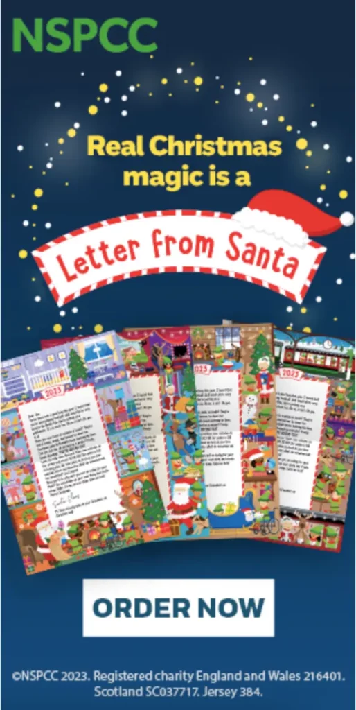
At a time of year when commercial messaging is everywhere, NSPCC’s Christmas banner ads appeal to the hearts and minds of parents. The dark background, starry sky, and Christmas imagery evoke that cozy, Christmassy feeling. And the clear and straightforward messaging reminds viewers of what Christmas magic looks like for children, beyond the presents.
2. This banner ad with clever imagery from Norton
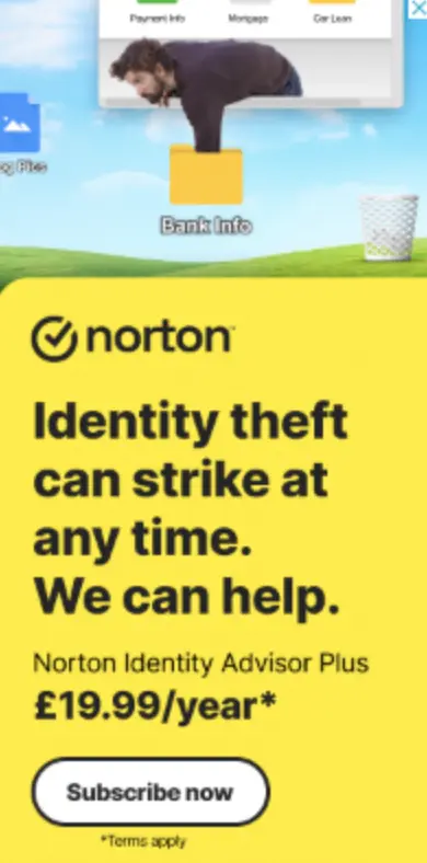
This banner ad from Norton uses simple but clever image editing to make it crystal clear why potential customers should subscribe to their product. It almost errs on the side of humor, but with a serious message that hits home. Beneath that, the bright primary color and bold text grab attention, with just the right amount of information needed for internet users to make their decision and take the next step.
3. This simple banner ad from Virgin Media O2
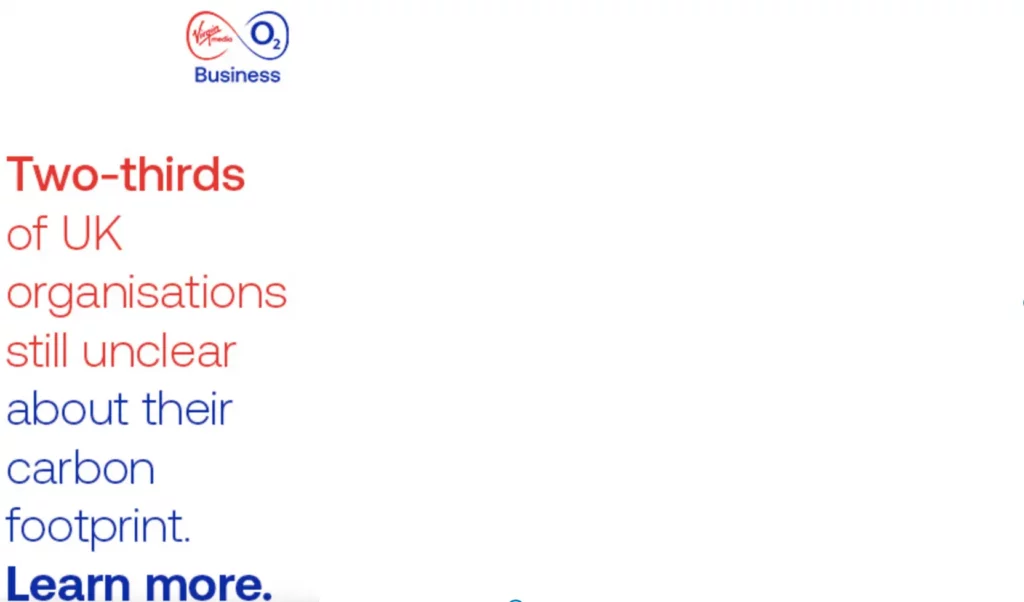
This banner ad from Virgin O2 is a great example of a simple and clear ad that works. It may not have fancy graphics or imagery, but the B2B ad uses a streamlined color palette and straightforward messaging to appeal to its audience.
4. KLM’s wanderlust-inspiring banner ad

The plane. The temple. The happy travelers. This video banner ad instantly creates a feeling of wanderlust, with the bright blue sky echoed in the sky blue text box proving particularly appealing as I write this on a cloudy, gray day. The large call to “Embrace the world” stands out, and the contrasting orange text box for the CTA draws your eye and encourages you to click through.
5. This animated ad from Ben & Jerry’s

Ben & Jerry’s is renowned for its colorful, creative advertising, and this brightly-colored, animated banner ad is perfectly on brand. The bright blue draws your attention, the big, bold font makes it immediately clear what’s on offer, and the falling cookie dough makes you hungry – and ready to enter the competition.
6. Universal’s multi-product banner ads
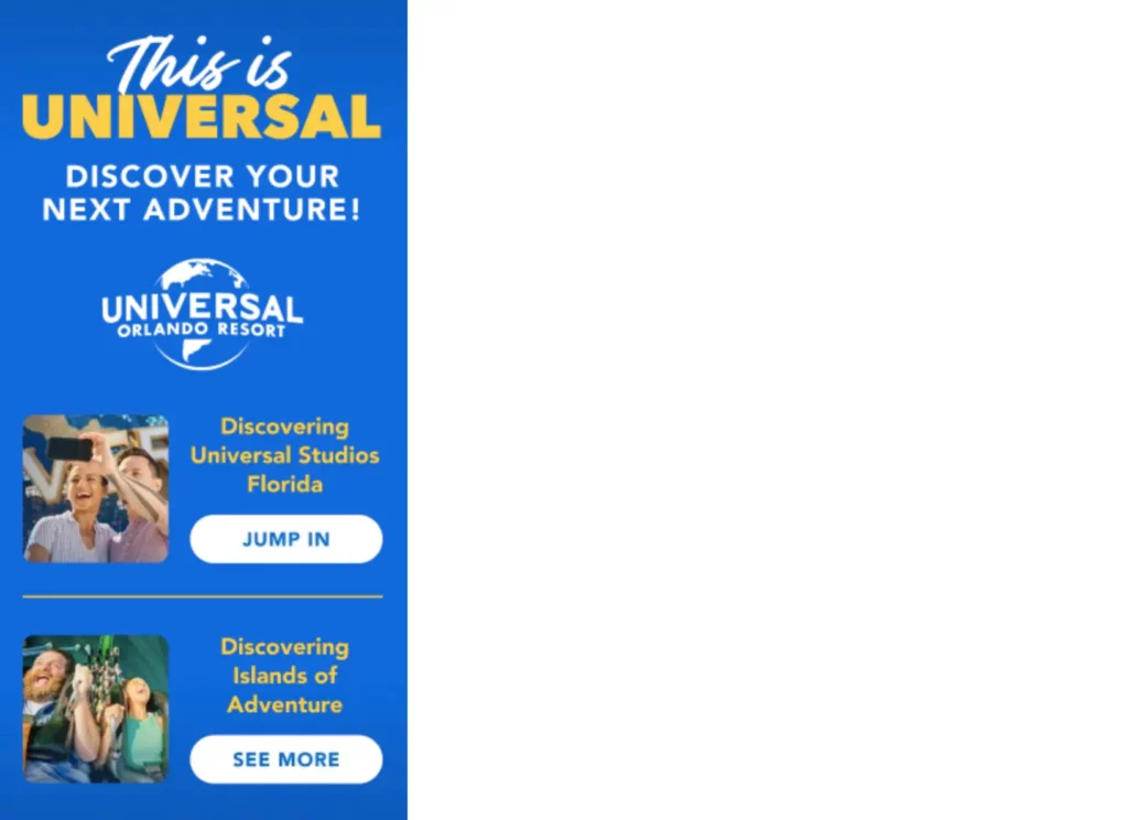
Here’s an excellent example of a skyscraper banner ad making the most of its height to advertise multiple products. The design is clean and uncluttered – important if you choose to use the multi-product technique – and readers have the choice of finding out more about two of Universal’s offerings.
7. Pandora’s sophisticated skyscraper ad

On a busy web page, white space can provide welcome relief for readers’ eyes. It also enhances readability and allows key elements of the ad to stand out – like the beautiful product imagery in this Pandora ad. The simplicity of the ad reflects the elegance of the brand and product, and offers a sense of calm and clarity to viewers – the perfect mindset for jewelry shopping!
8. This storytelling banner ad for Amazon Alexa

This skyscraper ad uses its full height to take viewers on a journey, beginning with a dramatic photograph depicting a dangerous situation, and ending with the product as the solution. The information is spaced out nicely, in an uncluttered manner. This creates a sense of calm, as opposed to the panic you’d usually associate with all that smoke – which users will then associate with the brand and product.
The best MPU banner ads
MPU (Medium Rectangle) banner ads are widely used in display advertising due to their versatile size and shape. They’re typically 300 pixels wide and 250 pixels tall, and they can be integrated seamlessly within the content of web pages.
Here are some of the best examples I’ve found.
1. Samsung’s audience-appropriate banner ad
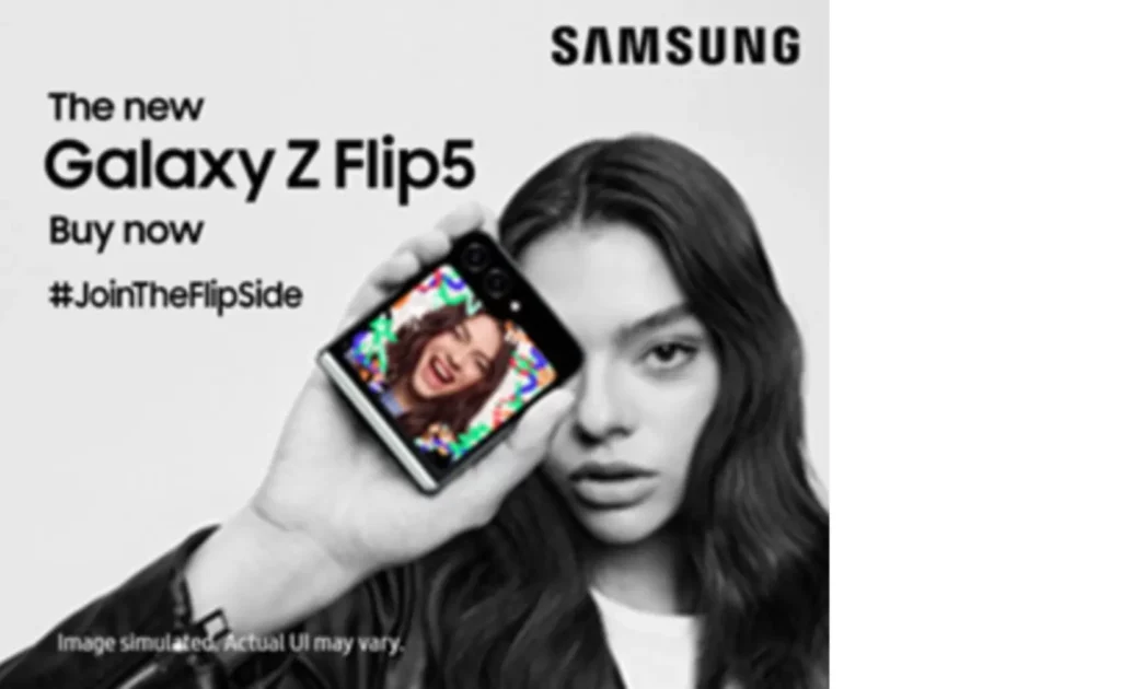
Samsung appeals to a Gen Z audience perfectly with its banner ad for the Galaxy Z Flip5. Black and white filter. Pop of eye-catching color. Sleek font. All that plus clear messaging and a hashtag to generate social engagement. It’s so simple, yet so effective.
2. This simple banner ad from Google

Sometimes simplicity is all that’s needed. Especially when you’re Google. A product image, the product name, and a CTA. And there’s no denying its effectiveness!
3. Knorr’s on-brand banner ads

Knorr’s color palette is almost as recognizable as the brand name itself, so it’s no wonder they’ve chosen to keep their color scheme front and center of their banner ads. The green and yellow of the product packaging is seamlessly integrated into the ad, and this cohesion is what catches the user’s eye, holds their attention, and makes them remember it.
4. This cheeky MPU banner from Emma

The cheeky question at the top of this ad instantly pulls you in. And once you’re hooked, the brand provides you with just enough information to know what the ad’s really about. The brightly colored CTA button contrasts perfectly with the neutral tones used in the rest of the advert, drawing the eye and encouraging you to take action.
5. This purple-powered banner ad from adidas

This bold ad from adidas is hard to miss, with its spectacular magenta color making it impossible to focus on anything else. As well as the color, the photography and messaging are fun and playful, appealing to its target audience and encouraging conversions in the lead up to the festive period.
6. This classic car ad from Volvo

Car brands are renowned for their high-end ads featuring high-quality imagery. And if it ain’t broke, don’t fix it! Volvo’s banner ad follows the classic route, and to good effect. A beautiful photo of the car with a backdrop of breathtaking scenery. Information about the best deals on offer. And a slogan to keep the brand front of mind.
Looking for more automotive inspo? Check out our roundup of the best car commercials.
How to speed up creative collaboration on your banner ads
Creating banner ads is a fun process. But getting approval isn’t always easy.
Enter Filestage.
Filestage allows teams to share, discuss, and approve files, all in one place. No more chasing for feedback, which means more time to focus on the creative part of the process.
With Filestage, you can even review HTML files, making it easy to get feedback on animated banner ads. If you’d like to see for yourself how Filestage can help with your display advertising review and approval process, start a free trial →


