

When it comes to winning hearts – and market share – branding and packaging do a lot of the heavy lifting. From the moment a customer spots your product on the shelf or scrolls past it online, your brand and packaging are speaking for you. They tell a story, spark emotions, and, ultimately, influence buying decisions. In fact, 72% of consumers say packaging design plays a big role in what they choose to purchase.
Getting branding and packaging right isn’t just about making things look pretty. It’s about creating a strong brand identity that resonates with your audience and designing packaging that brings it to life.
In this guide, you’ll learn exactly how to brand and package a product, with best-in-class examples to inspire your own process.
Let’s get started!
What are branding and packaging?
Branding and packaging are two separate but interconnected things.
- Product branding is your product’s personality. It’s the visuals, words, and values that tell people who you are and what you stand for. Your logo, color palette, tone of voice, and even the way you name your product are all part of your brand.
- Product packaging is how your product shows up in the real world. It’s the physical wrapper that catches your customer’s eye, whether it’s on a supermarket shelf or an online store. Done well, packaging protects your product, expresses your brand identity, and makes people want to pick it up.
And when branding and packaging work together? That’s when the magic really happens.
The fast way to get feedback on packaging
Get clear and collaborative comments right on top of your packaging artwork.
How to create strong product branding
The first step is to create your branding. A strong brand is the foundation of great packaging and great products. It’s what makes people feel something when they see your logo, hear your name, or pick up your product.
Here are three steps for building strong product branding.
1. Define your brand strategy
Whether you’re launching something new or refining an established brand, your brand strategy should be grounded in clear values, a deep understanding of your audience, and a strong sense of purpose.
Start with the big picture:
- What’s your brand’s purpose?
- What values do you stand for?
Then dive deep into your target audience:
- Who are they?
- What do they care about?
- What are their pain points?
The answers to these all-important questions will form your brand strategy and guide every creative decision that follows.
And don’t forget your personality – the tone, style, and attitude that make your brand feel human. It will help people connect with you, remember you, and choose you over other brands.
Old Spice is a great example of this. Its smart brand strategy doubled product sales in 2010.
2. Design your brand identity
Time to get creative! Your brand identity is the collection of visual and verbal elements that bring your brand to life, including:
- Logo
- Typography
- Color palette
- Imagery
- Tone of voice
The key is to align your creative choices with your strategy and your target audience. For example, a playful tone of voice and cartoon-style illustrations might work well for a children’s toy brand, while a muted palette and elegant font are more appropriate for a luxury skincare line.
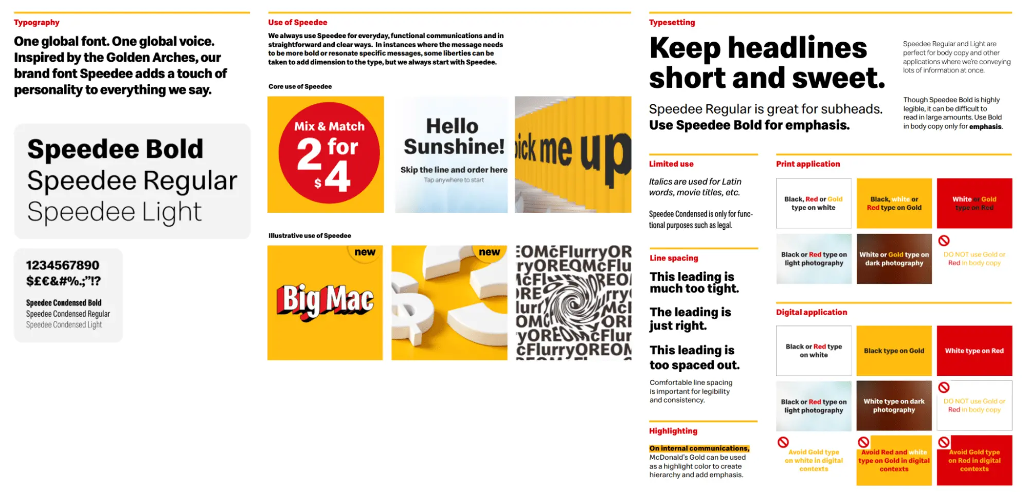
One of the best brand identity examples has to be McDonald’s. It’s warm, simple, and recognized all over the world.
Here’s just a snippet from its brand identity guidelines.
3. Create brand guidelines
It’s a well-known fact that the average person has to see a brand between five and seven times before they start to recognize it. This is precisely why consistency matters. By creating clear brand guidelines, you give everyone, from designers and copywriters to external partners, a toolkit to keep your brand identity consistent across every channel and touchpoint.
Your guidelines should cover the following essentials:
How to use your logo and color palette
- Tone of voice examples
- Packaging do’s and don’ts
- General brand governance guidelines
This helps make sure your brand always feels like your brand. In turn, that builds brand recognition, loyalty, and trust with potential customers.
How to design effective product packaging
Once you’ve nailed your branding, you can turn your attention to your product packaging. Your packaging is the first thing customers see when browsing stores, physical or online. So it should be designed to catch their eye. And of course, it should align perfectly with your branding.
Here’s how to get your packaging design process right.
1. Know your audience
The number one rule when designing packaging is to start with your audience in mind. A product aimed at Gen Z will likely look very different from one targeting seniors. And rightly so. Before you start designing your packaging, take the time to understand your target audience, their preferences, and their buying habits.
Are they looking for something playful? Minimalist? Sustainable? Luxurious? These insights can guide your creative choices and help you to create packaging that attracts those that matter.
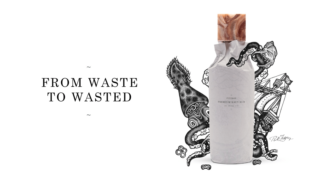
Take this sustainable packaging example from Fitzroy Premium Navy Rum.
It recycles and reuses washed-up Coca-Cola labels to come up with this incredibly unique packaging design that aligns with its audience’s values. Interestingly, it made the decision not to brand the bottle to encourage consumers to reuse it. Genius.
2. Make it stand out
Your packaging is going to compete with dozens (if not hundreds) of other products on the shelf or online. So, how do you make sure yours gets noticed?
Here are a few ways to make your packaging stand out:
- Use bold colors
- Try unique shapes
- Play with textures and finishes
- Create a visual hierarchy
- Tell a story through copy or design
- Include sustainable materials
- Use your brand voice
- Design for a memorable unboxing experience
I can’t mention unboxing experiences without mentioning Apple’s packaging strategy. It created packaging so elite that people keep the boxes as collector’s items (and unboxing videos rack up millions of views).
That’s how you stand out in a crowded market.
3. Keep it functional
Your packaging needs to look good, but above all, it needs to work. It should be easy to use and provide good protection for your product during shipping and handling. It should also include just the right amount of information about product usage and instructions.
Here are some key factors to consider as part of your packaging strategy:
- Ease of assembly
- Accessibility and ease of use
- Opening/closing mechanisms
- Product fit and protection
- Product placement
- Safety requirements
- Regulatory and legal requirements
- Storage and space efficiency
- Handling and transportation
- Durability
- Sustainability and environmental impact
4. Stay true to your brand
Your branding and packaging should work together in perfect harmony, so make sure the design aligns with your brand identity and values. And always refer back to your brand guidelines throughout the process.
Use your brand colors, typography, and tone of voice to ensure a consistent brand identity and seamless customer experience. A consistent look helps build brand recognition and trust – two things that can create brand loyalty and turn a first-time buyer into a devoted customer.
How Filestage helps speed up branding and packaging approvals
A proper review and approval process is the secret to keeping your branding and packaging consistent. And compliant.
From your brand guidelines through to your packaging designs, it ensures everything is accurate, on-brand, and error-free. No off-brand colors. No rogue fonts. No dodgy messaging. It also helps catch mistakes like typos or missing info, which could cause issues down the line.
Online proofing software like Filestage automates this workflow, cutting the approval process by 30%.
More importantly, it makes sure all the necessary stakeholders properly review your branding materials and product packaging long before they hit the shelves. That prevents any costly mistakes from slipping through the cracks.
With Filestage, you can easily:
- Invite reviewers at different stages of the branding and packaging approval process
- Annotate and leave feedback on brand assets and packaging designs
- Consolidate and track all revisions on a single deliverable
- Compare file versions side-by-side to check every change has been made
- Manage version control to make sure you never use an outdated design
- Kill the dreaded email-forwarding feedback cycle
The best branding and packaging examples of all time
Here are nine standout examples of branding and packaging working hand in hand to create something unforgettable.
1. Apple iPhone
Let’s circle back to Apple. The iPhone’s packaging is renowned for its meticulous attention to detail, sleekness, and overall user experience. The clean white packaging, crisp edges, and perfectly placed contents all reflect Apple’s minimalist, premium branding. This is a first-class example of branding and packaging working together to create an experience that’s as polished as the product itself.

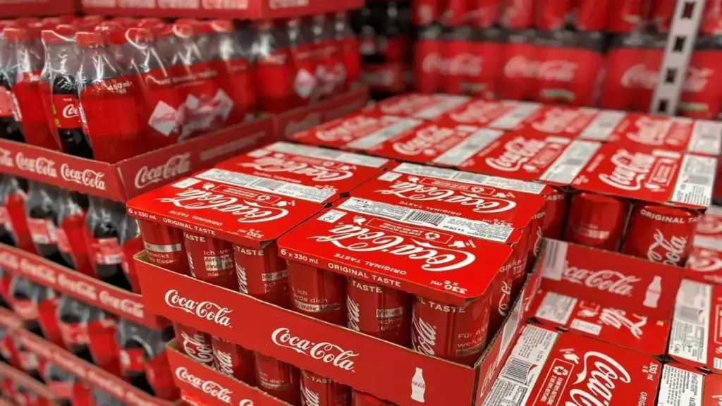
2. Coca-Cola
I couldn’t do a branding and packaging line-up without mentioning Coca-Cola. The bold red color and iconic logo mean that every single Coca-Cola product is instantly recognizable. Over the years, the product packaging has evolved, but the core brand identity has stayed refreshingly consistent every step of the way.
The combination of strong branding and smart packaging design has helped to build a lasting emotional connection across shelves, generations, and continents!
3. Tony’s Chocolonely
Tony’s Chocolonely is bold, bright, and impossible to ignore. And that’s exactly the point! Every detail, from the chunky fonts to the clashing colors, mirrors the brand’s message of standing out and speaking up about exploitation in the chocolate industry.
The product packaging makes a great first impression and is designed to spark curiosity and conversation, particularly among a younger, more socially aware demographic. And the use of sustainable packaging materials appeals to this eco-conscious audience.

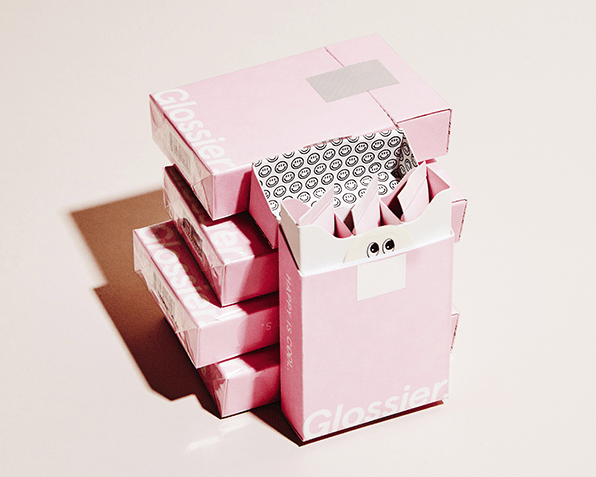
4. Glossier
Glossier’s modern and minimalist branding and product packaging align perfectly with its ethos of natural beauty and authenticity. From the clean typefaces and soft color palette to the chic pink bubble pouches, every detail feels fresh, fun, and effortlessly on-brand. What’s more, the unboxing experience appeals to its youthful female audience, creating serious buzz and a loyal fan base to match.
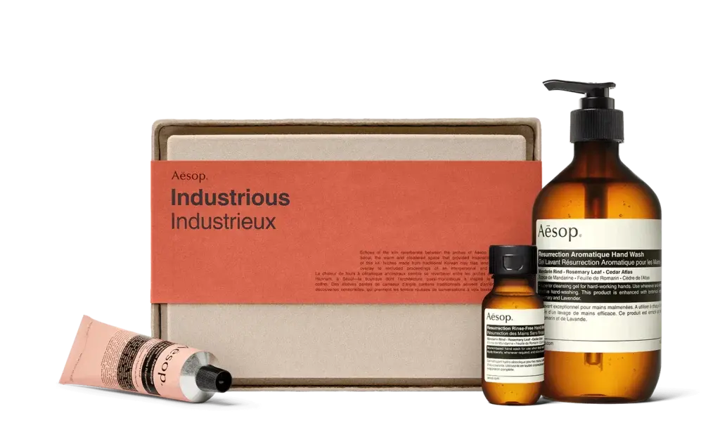
5. Aesop
Aesop’s branding is all about understated luxury, and its product packaging brings that to life beautifully. The amber glass bottles, minimalist labels, and apothecary-inspired design reflect the brand’s focus on simplicity, quality, and timelessness. Thoughtful details like pump dispensers and droppers highlight Aesop’s commitment to combining form and function, with packaging that’s as practical as it is elegant.
6. Who Gives A Crap
Who Gives A Crap turns toilet paper into a conversation starter (who knew that was possible?!). And its packaging plays a starring role. The bold colors, playful copy, and patterned paper wraps bring the brand’s cheeky, feel-good personality to life while reinforcing its eco-friendly mission.
By ditching plastic in favor of fun, display-worthy designs, the packaging doesn’t just protect the product – it fully embodies what the brand stands for. And it stands out from the competition!

7. Toblerone
Toblerone has to be one of the most iconic examples of brand packaging the world has ever seen. The unique, triangular box works wonders for brand identification. It mirrors the shape of the chocolate inside and gives a nod to the Swiss Alps.
The distinctive typography and sophisticated color palette reflect Toblerone’s brand heritage and identity.

8. Pringles
Pringles is a brilliant example of branding and packaging becoming one and the same. The iconic tube was originally designed as an ingenious solution to keep chips intact. But over time, it’s become a core part of the brand’s identity. The main part, in fact.
Paired with bright colors, bold graphics, and the beloved Pringles mascot, the packaging is fun, functional, and totally unique. It stands out on the shelf and makes the product instantly recognizable, wherever you are in the world.

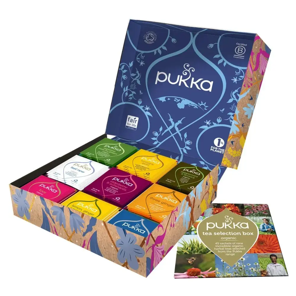
9. Pukka Herbs
Pukka Herbs’ packaging brings its brand to life through vibrant colors, intricate illustrations, and botanical patterns. Together, these reflect the natural ingredients in each blend while celebrating the brand’s roots in wellbeing and Ayurvedic tradition.
But it’s not just pretty.
Each box guides you to the perfect choice of blend, with clear details about ingredients and benefits. It’s thoughtful, expressive, and 100% on brand.
The fast way to get feedback on packaging
Get clear and collaborative comments right on top of your packaging artwork.
Nail your branding and packaging with Filestage
I hope you’ve enjoyed learning how to brand and package a product! When branding and packaging are done well, they can spark curiosity, build trust, and create a genuine connection with your audience. From defining your brand’s values and creating your visual identity to designing packaging that brings it all to life, every step plays an important role in shaping how your product is seen and remembered.
And if you need a smart way to review your branding assets and packaging designs, Filestage can help. Start a free trial today to share files, collaborate on feedback, and track approvals – all in one place!