Magazine advertisements may have dwindled in popularity since the advent of digital marketing, but they still hold a special place in our hearts.
Studies show that 82% of consumers trust print ads the most when it comes to making a purchasing decision.
And let’s not forget the tactile effect of print collateral. People engage with print in a more meaningful way, making magazine ads an excellent way to leave a lasting impression.
That means every element (design, messaging, placement, etc.) must work together to grab your audience’s attention and stick in their minds.
Marketers, keep reading. I’m breaking down 12 of the most creative magazine advertisement campaigns ever. Plus, I ask a seasoned CMO for his seven golden rules for success.
1. Volkswagen – “Hedgehog and Fish” magazine ad

Source: Ads of the World
Volkswagen wanted to boost the sales of optional equipment for its cars. One of these features was a park assist. So, it created this visually stunning (and memorable) magazine ad. The imagery of the hedgehog and the fish grabs readers’ attention and sticks in their minds.
Why it works
We all feel the stress of parallel parking (well, I do anyway). This ad uses unexpected imagery to paint us a very real picture of trying to park in a high-stakes spot. As a result, it creates an emotional reaction.
And emotional messaging is twice as likely to create large profit gains, according to Ad Age research.
It also shows just how precise parking is with Volkswagen without telling us.
P.S. If you’re a fan of ads, check out my roundup of the top five outdoor marketing trends for 2025.
Supercharge your marketing reviews
Share, review, and approve all your content in one place with Filestage.
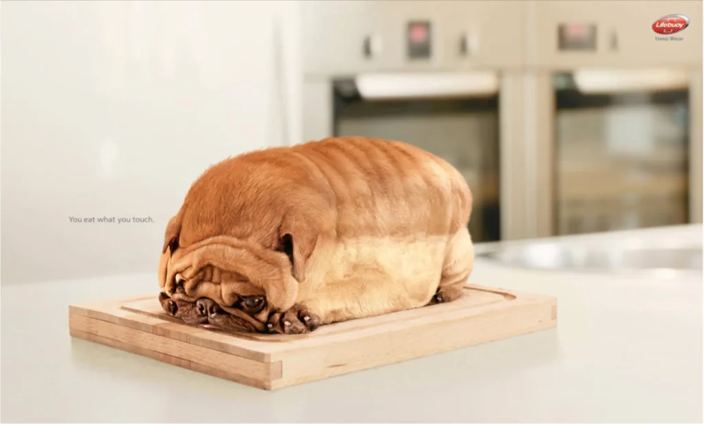
2. Lifebuoy – “Dog”
Source: Ad Forum
Lifebuoy is an Indonesian hand wash brand that’s known for its eye-catching magazine advertising campaigns. And this is one of the brand’s most famous print advertisements to date.
The goal behind this print advertisement is to remind its target audience of the dangers of poor hygiene.
Why it works
Lifebuoy gives a masterclass in creating a magazine advertisement that stops the page flippers in their tracks.
Aside from a memorable image, the big win is that there’s one clear message: “You eat what you touch.”
I asked Kate Smiley-Rodgers, Global Brand Director at GE Healthcare, for her opinion on clear messaging. Here’s her advice.

“The print ads that often move us are the ones that drive an emotional response with one clear point – rather than throwing all of the details, specs, and features at the audience.”
Kate Smiley-Rodgers, Global Brand Director at GE Healthcare
She also recommends using the platform to your advantage by finding ways to be more creative with the print placement, playing on the magazine’s focus, or using the page to bring the ad to life.
“I often see brands use these placements as a plug-and-play, but there’s an opportunity for them to work hard for you if you apply a creative mindset to them.”
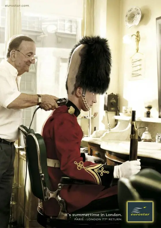
3. Eurostar – “It’s summertime in London” ad campaign
Source: Creative Criminals
This magazine ad by Eurostar is absolute gold. The railway company wanted to promote its offer of train tickets from Paris to London. This could easily have been another generic print ad, but instead, it’s an instant classic.
Why it works
I love this magazine advertising campaign from Eurostar because it speaks directly to its target audience. It takes an iconic British image (the Royal Guard) and tells us a story.
The copy is simple and gives us everything we need to know – we can catch a Eurostar train to London this summer for just 77 euros.
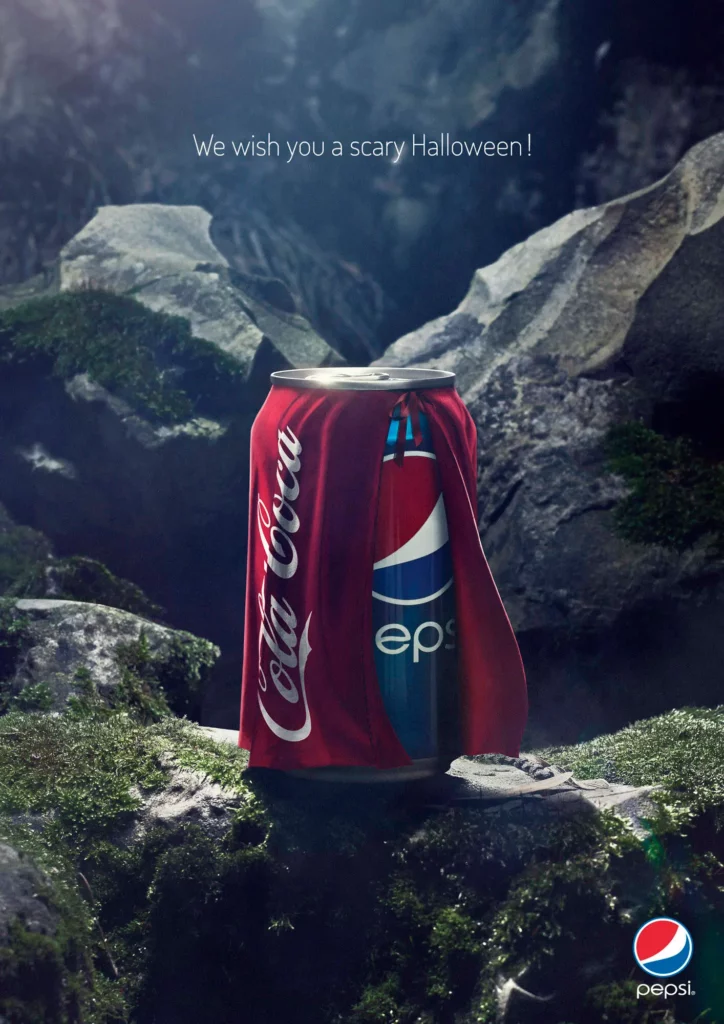
4. Pepsi – “We wish you a scary Halloween”
Pepsi released this ad campaign in the run-up to Halloween as a way to promote the brand and take a jab at the competition.
Fun (and semi-related) fact. Pepsi’s brand name comes from its original marketing focus. It started as a remedy for Dyspepsia, which is a fancy word for indigestion.
Now back to the advertisement.
Why it works
Ok, confession time. I don’t think this is a strong ad. The concept (in my humble opinion) is a bit weak. It also left the door open for Coca-Cola fans to hit back with a new take on the ad featuring the same image but the line “Everybody wants to be a hero”.
So why have I featured it here if I don’t like it? Simply because it plays on the long-standing and mutual “battle” between Pepsi and Coca-Cola (or should I say Cola Coca?!)
It has plenty of visual appeal and gets its audience talking about the brand.
Source: Ads of the world
5. Heinz – Hot ketchup print ad

Source: X
Heinz rarely gets it wrong. Isabelle Aleksander, the Brand Strategy Leader at JDO Global, shares why she thinks Heinz has managed to wow us with its advertising since 1869.

“I have a special place in my heart for Heinz Ketchup. They brilliantly maximize their iconic assets in an innovative and compelling way. The strength and resolve in knowing who they are enables them to stretch their storytelling in fresh directions.”
Isabelle Aleksander, the Brand Strategy Leader at JDO Global
It has a long history of fantastic ad campaigns, and this creative is no different.
Why it works
I just have one word: simplicity.
When your image tells the full story without the need for copy, you’re usually onto a winner.
6. Marmite – “Breakfast”

Source: Ads of the World
If you’ve read my piece on brand strategy, you’ll know that I love Marmite. Well, I love the brand (the spread itself is not my cup of tea).
Marmite has run the same campaign for thirty years. Because it’s that good. It leans into the fact that you either love or hate it. It also gives a master class in brand consistency.
Why it works
This magazine ad works because it is simple, clever, and ownable. Only Marmite could run a campaign like this. The branded assets are consistent across all touchpoints, and the message is clear.
Supercharge your marketing reviews
Share, review, and approve all your content in one place with Filestage.
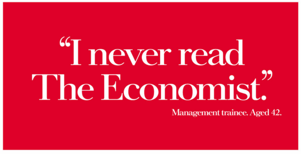
7. The Economist – “I never read The Economist” print campaign
Source: Ad Forum
The Economist’s “White out of Red” ad campaign is one of the most iconic advertisements in the world. All of the advertisements were great, but this is one of my favorites. Why? Because it says so much in just nine words.
Why it works
Everything about this works, from the instantly recognizable red and white logo to the message. The Economist knows exactly who its audience is, which allows it to deliver laser-precise messaging that resonates.
Don’t just take my word for it. Take a look at the results of this ad campaign (which ran from 1988-2001).
- 65% circulation increase
- 95% uptick in subscriptions
- Steadily growing advertising revenues
I first featured this as part of my top 16 print ads. Give it a read if you’re a fan of the classics.
8. BOSE – “Waterfall”

Source: Ads of the World
Bose is another brand that always kills it with creative ads. I also love its consistent use of branded assets across all its channels.
This print advertising campaign tells a whole story without the need for a second glance.
Why it works
It shows you the value of its product (noise-canceling headphones) in just a few seconds and without any copy. It also uses humor to connect with its audience and help the campaign stick.
Research from Oracle shows that 90% of consumers are more likely to remember a funny ad. But it needs to feel authentic.
I recently interviewed Creative Director Kevin Russell about how to use humor in advertising. Here’s what he had to say on the matter.

“Authenticity comes from truth. As any stand-up comedian will tell you, it’s better to be unfunny telling the truth than trying to make people laugh with a lie. It’s virtually impossible to make a person laugh with a lie. That’s why we love great impersonations. The closer the performance is to reality, the better the jokes land.”
Kevin Russell, Creative Director
9. Windex – “Magician”

Source: Addshots
This Windex ad shares a familiar scene – a magician performing one of the most jaw-dropping feats. Then, it playfully suggests that the magician has some help from a pristine glass support (made invisible to the naked eye thanks to Windex).
All this with not one word of copy. Sorcery!
Why it works
It’s just really clever. The product placement. The concept. The fact that it still feels so on-brand and thematic. It all works.
10. Utopolis Group of Cinemas – “Titanic”

Source: Marketing Examples
If Utopolis Group of Cinemas isn’t on your radar, this is your sign to check out its ads. The group of cinemas has created a strong concept based on the idea that reality sucks. It then merges iconic moments from our favorite movies with the day-to-day struggles of life. And I am a fan.
Why it works
I will always remember this magazine ad. It’s hilarious and fits perfectly with the brand’s “Reality sucks” concept. Relatable, memorable, and strongly branded.
11. DHL – Courier service
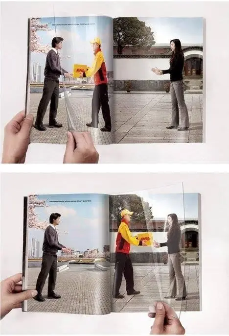
Source: Brilliant Ads (LinkedIn)
DHL is another brand that does a great job with brand governance. It uses consistent branded assets across all touchpoints, and there’s always a concise message.
This campaign aims to promote its super quick courier service.
Why it works
Interactive ads are one of the biggest print advertising trends at the moment. From Ikea’s pregnancy test ad to “phygital” campaigns with QR codes or AR elements, audiences want multi-sensory experiences.
The double-page spread uses a middle divider to show a DHL courier delivering a package from one place to another. Readers can interact with the ad, helping it stick in their minds.
12. Mexico Design – “Finger”
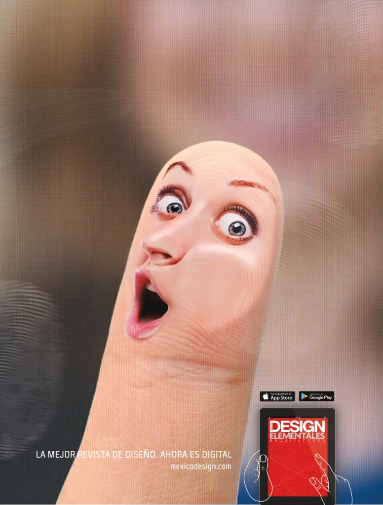
Source: Ads of the World
Mexican Design is a design and architecture magazine. Back in 2016, it collaborated with Cerocuatro ad agency to create this magazine advertisement. The goal was to promote the new digital version of the design magazine.
Why it works
I will always remember this finger.
Seven magazine advertisement lessons from an expert CMO
I asked the founder and CEO of Strategic Pete how to get magazine ads right.
His first lesson? Finding that balance between eye-catching creativity and a clear, targeted message.

“The best ads in history – think Volkswagen’s “Think Small” or Apple’s “Think Different” – succeeded not just because they were visually memorable, but because they connected deeply with their audience.”
Peter Murphy Lewis, Founder and CEO of Strategic Pete
Here are his seven must-know lessons.
1. Know your audience … inside out
Lesson number one is a bit like the holy grail for marketers, designers, and copywriters. You have to understand who you’re talking to. After all, your ad will look very different depending on who you’re targeting and what publication it will appear in.
“Are you targeting a niche group of high-end consumers flipping through luxury lifestyle magazines, or is your ad geared towards a broader, more general audience in a mainstream publication? A good ad speaks directly to its intended audience, and you can’t fake that.”
2. Simplicity cuts through the noise
Strategic Pete points out a common theme running through the best magazine ads he has seen and worked on.
They use simplicity to cut through the noise.
That means removing unnecessary text or design elements and avoiding overcrowding the ad space.
“You want your core message to hit within a few seconds of someone glancing at the page. Focus on one primary image or message that does the heavy lifting.”
3. Design for print, not digital
Pete reminds us just how big the difference is between how people consumer content in a magazine versus on a screen.
Research shows that readers typically spend 20 minutes or more with a printed publication in their hands. That’s 15 minutes longer than the average visitor to a digital news site.
It’s hardly surprising, then, that great magazine advertisements create a multi-sensory reaction. Think about how the different elements will work together to make a tactile experience for readers.
“With a physical magazine, readers tend to slow down, so they have more time to absorb the details. High-quality, tactile imagery with vibrant colors and smart use of typography can go a long way. Keep in mind print bleed, resolution, and how the ad will look across different page formats.”
4. Tell a story, even on a single page
There’s a lot of pretty compelling research to show the impact of storytelling on everything from conversion rates to brand value.
For example, Leapmesh data revealed that effective storytelling can drive a 30% increase in conversion rates. The same research also reported that 15% of consumers would buy a product immediately if they loved the brand’s story.
As Pete points out, people connect with stories, and magazine ads offer a unique space to tell one in a visually-driven way.
“Whether through clever copywriting, a standout image, or a combination of both, a strong narrative should run through the ad. A personal favorite example is Nike’s “There Is No Finish Line” campaign—just one image and a powerful message, but the story it tells about perseverance and striving for greatness is universal.”

Source: Nike
5. Nail the review and approval process
Creative by committee can be a nightmare. Your message can quickly become diluted as more stakeholders enter the review process until the final product is almost unrecognizable.
But with compliance regulations getting stricter and the review process becoming more complex, it’s inevitable that more people are now involved.
Pete points out the need to streamline the review and approval process.
“This is where a lot of ads can get bogged down. Everyone wants to weigh in, from the creative team to executives, but it’s crucial to streamline the review process.”
He suggests building clear workflows and using online proofing software to keep the process flowing.
“Tools like Filestage are a godsend for this. They allow everyone to see the latest version, comment directly on it, and approve or suggest edits—all without endless email chains and confusion over which file is the final one. Keeping the approval process clear and organized can make sure you hit deadlines without compromising the quality of the ad.”
For example, you can use Filestage as a central hub for all your creative assets (from magazine ads to brochures to catalogs). That way, all stakeholder feedback and content versions are in an accessible dashboard so you can quickly find the asset you need.

6. Remember the power of ad placement
Here’s a friendly reminder from a seasoned CMO: it’s not just about the design of your magazine advertisements. It’s also about how the ad lives within the magazine’s flow.
“Where your ad shows up in the magazine is as important as the ad itself. Is it on the back cover, where it’s more likely to be noticed, or buried between the editorial content?”
Pete recommends negotiating for premium placement if it fits your budget. It can make all the difference.
7. Prioritize brand recognition
Let’s talk about brand consistency. Presenting a cohesive identity (and messaging) across all your brand platforms can drive sales and build consumer trust.
In fact, businesses that present their brand consistently across all touchpoints enjoy a 33% revenue boost.
Pete reminds us how easy it is to stray off-brand with your creative. Especially when you’re excited about a new concept. But your magazine ad needs to reflect your overall brand in terms of tone, style, and message.
“There’s nothing worse than a beautifully designed ad that feels like it belongs to a completely different company.”
This ties back to having a solid review and approval process. The right software can help you maintain brand consistency across all your creative assets, from magazine advertisements to packaging design.
Let’s take Filestage as an example.
You can use it to:
- Compare content versions side by side to easily spot branding inconsistencies
- Get an extra pair of eyes with the AI feature (it flags text errors and words that go against your brand TOV)
- Include your branding expert in the review process at the right stage
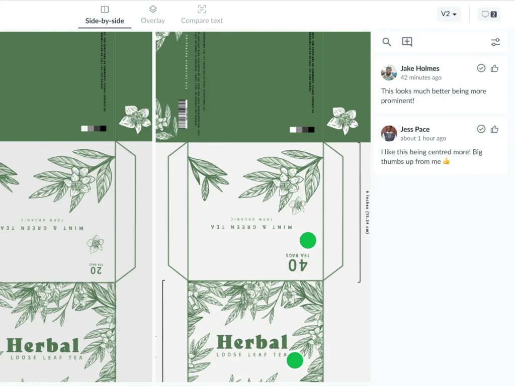
The image below shows how the auto-compare feature works.
Review magazine ads 30% faster with Filestage
Magazine advertisements give your brand a chance to make your audience feel. Unlike digital campaigns, you can play with all of the senses for a tactile experience.
But for magazine advertising to be successful, a proper review and approval process is a must. Filestage gives your creatives and other stakeholders a shared space to leave feedback, manage old content versions, and store assets.
Get a free trial to see how you can review magazine ads 30% faster.